Changes in the Region Graph – Business Strategy and Outcomes
RJ0500043_21
- Last Update 06/19/2025
- File Size 0.4MB
- # of Slides 2
- File Format PPTX
- Slide Ratio 16:9
- Color
Keywords
About the Product
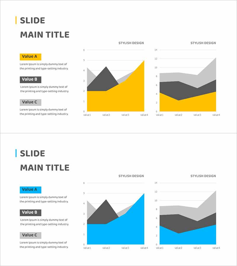
A PowerPoint slide featuring an area chart that visualizes business strategy execution and performance outcomes over time. The dual-layer stacked area chart uses yellow and gray colors to represent multiple metrics, clearly showing cumulative trends and individual component changes. The left side includes three labeled text boxes (Value A, B, C) for descriptions, while the right side displays two independent graph areas for comparative analysis. This slide layout is ready for immediate use in presentations and reports, making it ideal for visualizing financial performance, business KPIs, marketing results, and operational metrics.
Usage Points
-
Main Usage
Designed to visualize business execution results and performance outcomes across time periods. The stacked area chart simultaneously displays total trend and individual component proportions, making it ideal for presenting goal achievement rates, revenue growth trends, market share changes, and multi-dimensional performance metrics with strong visual impact.
-
How to Use
Enter descriptions for each area layer (Value A, B, C) in the left text boxes, then input actual data into the right graph areas. Use the two independent chart zones to compare different perspectives of the same metric (e.g., by department vs. by region) or to show performance across different time periods. Yellow and gray colors are fully editable to match your corporate branding.
-
Recommended For
Ideal for business progress reports, quarterly and annual performance presentations, investor relations materials, executive briefings, and marketing performance analysis. Particularly effective when consolidating results from multiple departments or comparing actual performance against targets.
-
Slide Structure
The slide consists of a title area, left text description section with three labeled items, and right side with two independent area chart zones. Each chart displays a four-point stacked area graph with legend and axis labels, allowing immediate use in presentations after data entry.
Related Products
-

Business Promotion Strategy Slide Template – Effective Information Delivery and Visual Composition
#Business Strategy #Graph #Other
-

Future Target Market Share Donut Chart – Performance and Competitiveness
#Business Strategy #Market and Competitor Analysis #Graph
-

Eco-friendly Survey Graph – Environmental Protection and Data Utilization
#Business Strategy #Market and Competitor Analysis #Graph
-

Financial Performance and Forecast – Diagram for Business Strategy
#Business Strategy #Financial Plans and Performance #Diagram
