Analysis of Online Learning Data Slide
RJ0500041_20
- Last Update 06/18/2025
- File Size 0.3MB
- # of Slides 2
- File Format PPTX
- Slide Ratio 16:9
- Color
Keywords
- #Content-Based Slides
- #Design-Based Slides
- #Market and Competitor Analysis
- #Diagram
- #Graph
- #Market Analysis
- #Cluster
- #Column
- #Closed Cluster Diagram
- #Grouped Column
- #16:9
- #grouped bar chart PowerPoint
- #data comparison slide template
- #4-item bar graph
- #2-series comparison chart
- #how to create grouped bar chart in PowerPoint
About the Product
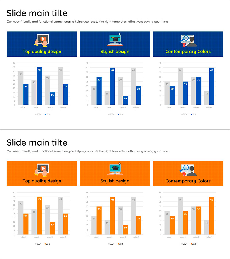
A grouped bar chart PowerPoint slide designed for online learning data analysis and comparative visualization. The slide features a navy background with bright blue and gray bars representing 4 items across 2024 and 2025 data series. Numerical labels are clearly displayed above each bar for immediate readability. This presentation slide is ideal for market analysis, competitive analysis, performance comparison, and business reporting where side-by-side data comparison is essential.
Usage Points
-
Main Usage
Designed to compare two or more time-series datasets across multiple categories, such as online learning metrics, market performance, or competitive benchmarks. The grouped bar layout enables viewers to quickly identify differences between data series and make data-driven decisions during presentations.
-
How to Use
Replace the sample values (value1–value4) and series labels (2024·2025) with your actual data. The bar heights and numerical labels automatically adjust to reflect your numbers. The navy background and blue-gray color scheme maintain professional presentation aesthetics. Simply insert into marketing plans, quarterly reports, or analysis decks.
-
Recommended For
Marketing teams presenting campaign performance metrics, sales teams comparing quarterly results, data analysts sharing market research findings, and executives preparing board reports. Particularly useful for EdTech companies visualizing user engagement, learning hours, completion rates, and platform adoption trends.
-
Slide Structure
Two-slide layout with navy backgrounds. Each slide displays an icon and category title (Top quality design, Stylish design, Contemporary Colors) at the top, followed by a grouped bar chart with 4 items and 2 data series. Numerical values appear above each bar, and a legend (2024·2025) is positioned at the bottom for clear data interpretation.
Related Products
-

Competitor Comparison Analysis Bar Graph – Data Visualization for Market Analysis
#Market and Competitor Analysis #Diagram #Graph
-

VR Market Analysis Bar Graph
#Market and Competitor Analysis #Diagram #Graph
-

Business Plan Competitor Analysis Chart – Effective Market Analysis Tool
#Market and Competitor Analysis #Diagram #Graph
-

Bio Industry Status Analysis Chart
#Company Introduction #Market and Competitor Analysis #Diagram
