Current Status of School Violence from Data – Utilizing Bar Graphs
RJ0500040_29
- Last Update 06/18/2025
- File Size 0.5MB
- # of Slides 2
- File Format PPTX
- Slide Ratio 16:9
- Color
Keywords
- #Content-Based Slides
- #Design-Based Slides
- #Market and Competitor Analysis
- #Graph
- #Market Analysis
- #Horizontal Bar
- #Segmented Horizontal Bar
- #16:9
- #horizontal bar chart PowerPoint
- #bar graph slide template
- #data comparison presentation
- #statistical visualization slides
- #how to create bar chart in PowerPoint
About the Product
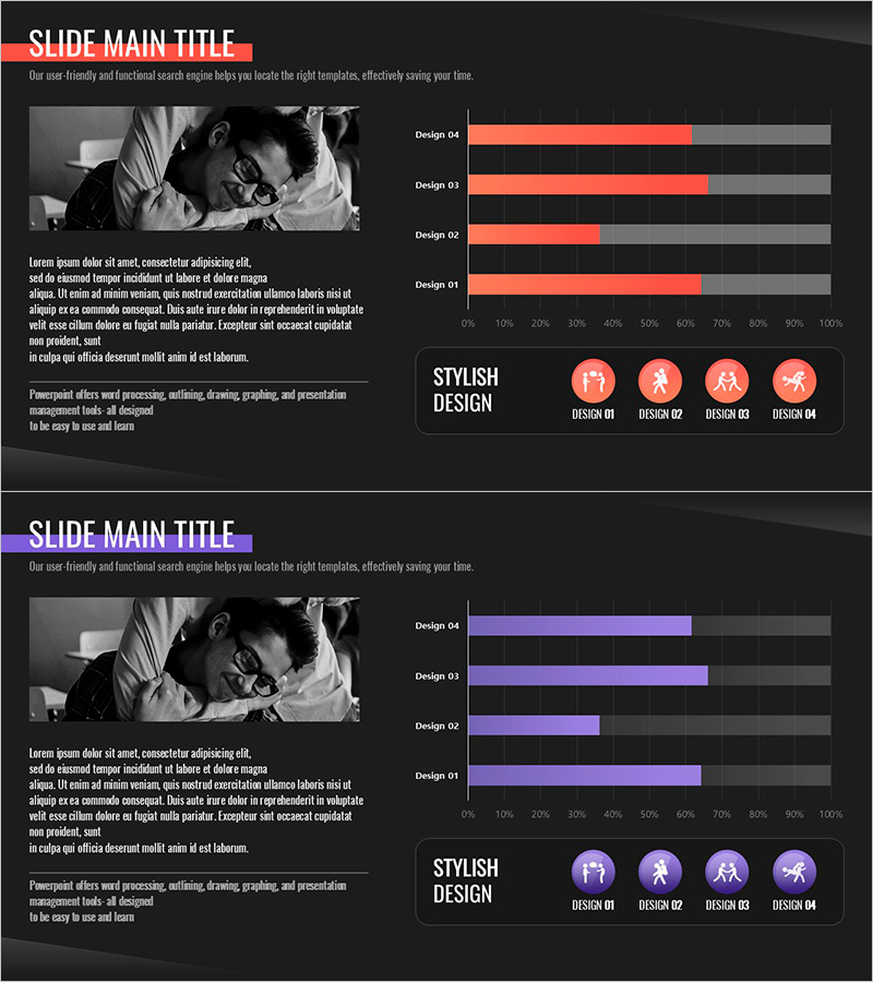
A horizontal bar chart PowerPoint slide designed for visualizing school violence data and comparative analysis. The template features four data items displayed side-by-side with orange and gray color contrast to highlight differences clearly. The 2-slide set allows you to present multiple datasets sequentially or repeat the same layout for consistency. Ideal for educational statistics, market research, performance reports, and quantitative presentations. Text and numerical values are fully editable, enabling quick customization for various analytical contexts.
Usage Points
-
Main Usage
Compares and analyzes quantitative data across four or more categories in presentations. Effectively visualizes school violence statistics, sales performance, satisfaction surveys, budget allocation, and other numerical information to enhance audience comprehension.
-
How to Use
Simply replace the bar lengths and labels with your own data values. Maintain the orange highlight and gray background for visual consistency, or adjust colors to match your organization's branding guidelines as needed.
-
Recommended For
Recommended for education officials presenting school violence prevention initiatives, corporate marketing teams analyzing market trends, government agencies explaining policy data, and researchers sharing academic findings. Suitable for any organization requiring data-driven decision presentations.
-
Slide Structure
Two-slide set, each containing a horizontal bar chart with four data items. Bars are scaled from 0–100%, with orange representing data values and gray showing the background scale. Item labels appear on the left, with numerical values on the right for easy comparison.
Related Products
-

Soccer Match Analysis Chart – Performance Analysis and Future Forecast
#Business Vision and Strategy #Market and Competitor Analysis #Graph
-

Market Entry Potential and Expansion Strategy Chart
#Market and Competitor Analysis #Graph #Market Status
-

Pie Chart & Bar Graph for Market Analysis – Visualizing Data
#Market and Competitor Analysis #Graph #Market Status
-

Minimal Design Visual Data Visualization Slide
#Market and Competitor Analysis #Graph #Market Analysis
