Happy Kids and Donuts Chart – Enjoyable Market Analysis
RJ0500037_25
- Last Update 06/17/2025
- File Size 1.1MB
- # of Slides 2
- File Format PPTX
- Slide Ratio 16:9
- Color
Keywords
- #Content-Based Slides
- #Design-Based Slides
- #Market and Competitor Analysis
- #Graph
- #Customer Analysis
- #Market Analysis
- #Circles
- #Doughnut Chart
- #16:9
- #donut chart PowerPoint
- #pie chart slide template
- #3-segment data ratio visualization
- #market analysis chart
- #customer segment donut chart
- #data comparison presentation slide
About the Product
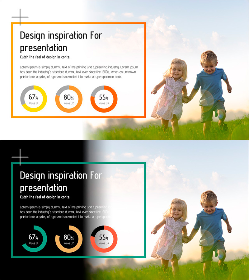
A PowerPoint slide template featuring three donut charts to visualize market share, customer segments, sales performance, and other key metrics. The three circular graphs display data in yellow (67%), orange (80%), and red (55%), arranged horizontally for easy comparison of multiple data points. Two design versions are included: a light background layout and a dark background layout, allowing you to match your presentation theme. The 16:9 widescreen format contains 2 slides with fully editable donut charts, percentages, and labels that can be customized to reflect your actual data immediately.
Usage Points
-
Main Usage
Display market share distribution, customer demographic breakdown, sales channel contribution, budget allocation, or survey results across three key categories simultaneously. The independent placement of each donut chart enables clear comparison of composition ratios across multiple data sets.
-
How to Use
Open the slide and replace the sample percentages (67%, 80%, 55%) and labels (Value 01, 02, 03) with your actual data. Select the light background version for bright-themed presentations or the dark background version for dark-themed presentations. All colors, numbers, and text are fully editable.
-
Recommended For
Marketing managers, sales directors, financial analysts, business executives, strategic planners, and market researchers who need to present data-driven insights with visual clarity and persuasive impact.
-
Slide Structure
2-slide deck with three donut charts per slide arranged horizontally. Each donut chart consists of a central circular area and an outer ring segment, with editable label zones below for item names and percentage values. All chart elements support direct editing.
Related Products
-

User Analysis Donut Chart – Optimal for Market and Competitor Analysis
#Market and Competitor Analysis #Graph #Other
-

Separate Recycling Implementation Rate Survey Donut Chart – Visualized in Blue and Green
#Market and Competitor Analysis #Graph #Customer Analysis
-

User Analysis Graph by Year – Insights into Customer Behavior
#Market and Competitor Analysis #Graph #Other
-

Quality PowerPoint Wide Template Analysis of Men and Women
#Market and Competitor Analysis #Graph #Customer Analysis
