Three Key Performance Pie Charts – Visualization of Performance Analysis
RJ0500036_18
- Last Update 06/16/2025
- File Size 0.5MB
- # of Slides 2
- File Format PPTX
- Slide Ratio 16:9
- Color
Keywords
About the Product
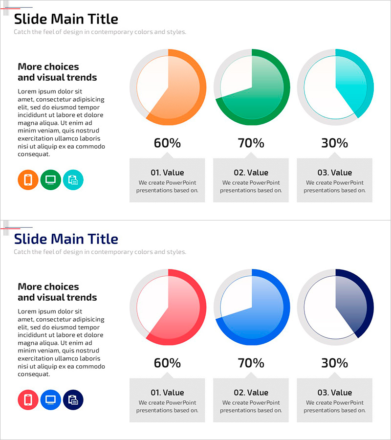
A PowerPoint slide featuring three pie charts to visualize performance ratios across three key metrics. Each donut-style pie chart displays data at 60%, 70%, and 30% respectively, rendered in orange, green, and cyan gradient fills with clear numerical labels. The left side provides space for title, context, and supporting text, while the right side showcases the three charts in a balanced layout. This 16:9 widescreen 2-slide set is ready for immediate use in performance reports, market share analysis, and business metrics presentations. The gradient color scheme and clean typography enhance data comprehension for executive and team audiences.
Usage Points
-
Main Usage
Visualize three key performance metrics, market share segments, or composition ratios in a single slide. Enables quick comparison of relative proportions and supports data-driven decision-making in executive reports, marketing presentations, and business performance reviews.
-
How to Use
Replace the placeholder text on the left with your presentation title and key message. Update the pie chart percentages and labels with your actual data values. Customize the gradient colors to match your corporate branding. Add descriptive text below each chart to provide context and interpretation of the data.
-
Recommended For
Finance, marketing, and sales professionals presenting quarterly or annual performance reports. Ideal for market analysis, budget allocation reviews, customer satisfaction surveys, brand awareness metrics, and resource distribution presentations requiring clear visual comparison of three data segments.
-
Slide Structure
Two identical slides with left-aligned text area (title, body, description) and right-aligned three pie charts. Each chart features a gradient fill (60%, 70%, 30% segments), white center space, and gray outer border for depth. Numerical percentage labels and 'Value' descriptors positioned below each chart for clarity.
Related Products
-

Pie Chart for Beer Market Share - Ideal for Market Analysis
#Company Introduction #Market and Competitor Analysis #Graph
-

Pie Chart of Composition Ratio by Fashion Type – The Start of Data Visualization
#Company Introduction #Market and Competitor Analysis #Diagram
-

Sensuous Cloud Presentation Template Pie Chart1 – Visualizing Market Share
#Company Introduction #Market and Competitor Analysis #Graph
-

Red-Blue Stereoscopic Pie Charts – Performance Visualization
#Company Introduction #Market and Competitor Analysis #Diagram
