Scientific Research Results Graph – A Tool for Market Analysis and Competitive Advantage
RJ0500035_19
- Last Update 06/16/2025
- File Size 1.8MB
- # of Slides 2
- File Format PPTX
- Slide Ratio 16:9
- Color
Keywords
About the Product
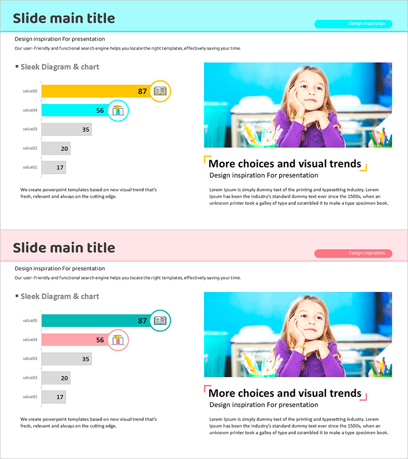
A horizontal bar chart PowerPoint slide optimized for scientific research and market analysis presentations. This slide template visualizes numerical data across five items, making it ideal for presenting research findings, competitive advantage analysis, and market share comparisons. The design features a light background with cyan, orange, and gray bar colors, ensuring excellent readability. Icon elements reinforce the meaning of each data category. The 2-slide set is ready to use immediately, with fully editable text and numerical values for customization.
Usage Points
-
Main Usage
Visualize scientific research outcomes, market analysis data, and competitor comparisons using horizontal bar charts to convey numerical information intuitively to your audience. The 5-item structure excels at relative size comparisons, effectively representing rankings, market share, and performance metrics.
-
How to Use
Replace the bar lengths and numerical values with your own data, then edit item names and legends accordingly. The color scheme of cyan, orange, and gray can be retained or customized to match your brand colors. Icons can be swapped to align with your analysis topic, enhancing visual consistency throughout the presentation.
-
Recommended For
Ideal for researchers in science, medicine, and IT sectors; marketing professionals; executives preparing reports; academic presenters; and consultants who need to create data-driven decision-making materials. Suitable for any presentation requiring emphasis on quantitative analysis results.
-
Slide Structure
The 2-slide set features horizontal bar charts with 5 data items each. Bars are color-coded in cyan, orange, and gray, with numerical values displayed to the right of each bar. Item names appear on the left, while legends and icons are positioned in the upper right, creating a clear information hierarchy.
Related Products
-

Illustration Brush Graph Analysis Slide
#Market and Competitor Analysis #Graph #Market Analysis
-

Bar Chart for Vegetable Intake Survey
#Market and Competitor Analysis #Graph #Market Analysis
-

Competitor Analysis Area Graph – Visualizing Market Status
#Market and Competitor Analysis #Graph #Market Analysis
-

Fire Dispatch Graph – Market Analysis and Competitive Advantage
#Market and Competitor Analysis #Graph #Market Analysis
