Curved Line Graph of Halloween Background – Suitable for Financial Performance Analysis
RJ0500033_23
- Last Update 06/16/2025
- File Size 1.5MB
- # of Slides 2
- File Format PPTX
- Slide Ratio 16:9
- Color
Keywords
- #Content-Based Slides
- #Design-Based Slides
- #Financial Plans and Performance
- #Graph
- #Projected Return on Investment (ROI)
- #Sales and Revenue
- #16:9
- #dual-line graph PowerPoint slide
- #2-series trend comparison chart
- #financial analysis graph template
- #sales performance slide
- #how to create a line chart in PowerPoint
About the Product
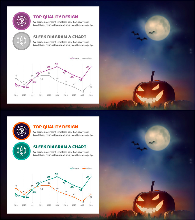
A 2-slide PowerPoint template optimized for financial performance analysis and sales trend comparison. This presentation slide features a dual-line chart displaying data from 2019 to 2028 across two independent series, with icon and text areas at the top for clear topic identification and explanation. Two versions are included: one with a Halloween-themed background and one with a neutral background, allowing you to select based on your presentation context. Instantly applicable for comparing investment returns, quarterly sales, budget versus actual performance, and other financial metrics.
Usage Points
-
Main Usage
This slide is optimized for comparing financial performance and sales trends over time by displaying two independent data series simultaneously. It clearly visualizes correlations and trend changes, making it ideal for investor reports, IR presentations, and executive meetings where financial metrics and performance changes need to be communicated persuasively.
-
How to Use
Enter your analysis topic in the icon area at the top (e.g., Revenue vs. Net Income, Budget vs. Actual), then replace the legend and data points with your actual figures. Input year-by-year data on the X-axis and numerical values on the Y-axis, and the graph updates automatically. Choose between the Halloween-themed or neutral background version to match your presentation's tone.
-
Recommended For
CFOs, finance managers, executives, and investor relations professionals reporting quarterly or annual financial performance. Ideal for business plans, investment pitch decks, management reports, and financial analysis presentations covering sales, profit, revenue rates, and cost trends.
-
Slide Structure
Each slide consists of an icon + title area at the top (2 input fields), a legend area in the middle (2-series labels), and a dual-line graph at the bottom (X-axis: 10 years, Y-axis: 0–90 range). The two series are distinguished by different colors (purple & gray, or orange & teal) for easy at-a-glance comparison.
Related Products
-

Revenue Model Slide Showing Subscriptions, Ads, and Partnerships
#Financial Plans and Performance #Graph #Projected Return on Investment (ROI)
-

Investment and Revenue Projection Strategy Slide
#Financial Plans and Performance #Graph #Projected Return on Investment (ROI)
-

Liquor Sales Line Chart – Visualizing Revenue and Profit
#Financial Plans and Performance #Graph #Projected Return on Investment (ROI)
-

Red Green Basic Line Charts – Visualizing Financial Performance
#Financial Plans and Performance #Graph #Projected Return on Investment (ROI)
