Ticket Sales Graph – Visualizing Competitive Edge
RJ0500032_6
- Last Update 06/16/2025
- File Size 0.2MB
- # of Slides 2
- File Format PPTX
- Slide Ratio 16:9
- Color
Keywords
- #Content-Based Slides
- #Design-Based Slides
- #Market and Competitor Analysis
- #Graph
- #Competitor Analysis
- #Competitive Advantage
- #Horizontal Bar
- #Horizontal Bar Chart
- #16:9
- #horizontal bar chart PowerPoint
- #competitor comparison slide
- #sales data visualization
- #bar graph PPT template
- #market analysis chart
About the Product
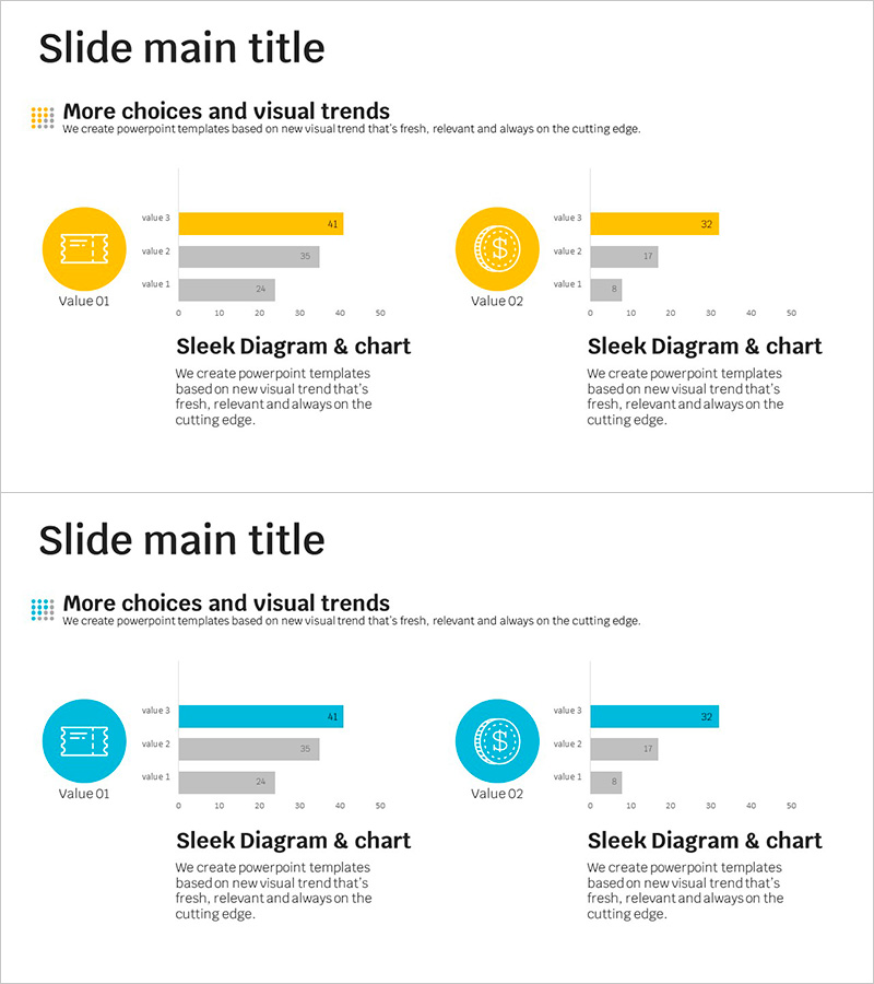
A horizontal bar chart PowerPoint slide that enables direct comparison of ticket sales and competitor performance at a glance. The dual-tone color scheme of yellow and gray clearly distinguishes primary metrics from comparison items, while circular icons intuitively convey the meaning of each category. Structured as 2 slides, this template allows repeated use of the same data visualization layout. Optimized for 16:9 widescreen format, it fits seamlessly into modern presentation environments. Ready for immediate deployment in sales reports, market share analysis, competitive advantage presentations, and any data-driven comparison scenario.
Usage Points
-
Main Usage
Visually compares three metrics—sales volume, market share, or competitor performance—using horizontal bars to substantiate competitive advantage. The dual-tone layout (yellow accent and gray comparison) ensures key metrics stand out, while circular icons enable instant recognition of each category's meaning.
-
How to Use
Deploy in sales reports, executive briefings, investor presentations, and market research summaries where competitor comparison is essential. Input your own figures to reflect real-time data, or reference existing values to create similar comparative charts for different datasets.
-
Recommended For
Sales, marketing, and strategy professionals presenting competitive analysis to executives, investors, and clients. Particularly suited for B2B proposals, investor relations materials, and quarterly performance reports requiring data-backed competitive positioning.
-
Slide Structure
2-slide template with identical layouts for repeated use. Each slide features a left-aligned circular icon (yellow background) paired with a right-aligned 3-tier horizontal bar graph. Header text at the top identifies the comparison topic. Optimized for 16:9 widescreen format across modern projectors and displays.
Related Products
-

Eco-friendly Eco Horizontal Bar Graph - Market Competition Analysis
#Market and Competitor Analysis #Graph #Competitor Analysis
-

Optimizing Competitor Analysis with Horizontal Bar Graph – Visual Impact
#Market and Competitor Analysis #Graph #Competitor Analysis
-

Red Blue Area Chart – Market and Competitor Analysis
#Market and Competitor Analysis #Graph #Competitor Analysis
-

Agricultural Competitor Analysis Horizontal Bar Chart
#Market and Competitor Analysis #Graph #Competitor Analysis
