Blue Orange Profit and Loss Chart – Visualizing Financial Performance
RJ0500031_7
- Last Update 06/15/2025
- File Size 1.9MB
- # of Slides 2
- File Format PPTX
- Slide Ratio 16:9
- Color
Keywords
- #Content-Based Slides
- #Design-Based Slides
- #Financial Plans and Performance
- #Graph
- #Income Statement
- #Key Financial Indicators
- #Column
- #Grouped Column
- #16:9
- #profit and loss chart PowerPoint
- #financial performance graph
- #horizontal bar chart slide
- #P&L visualization
- #financial data comparison
- #dual-series bar graph template
About the Product
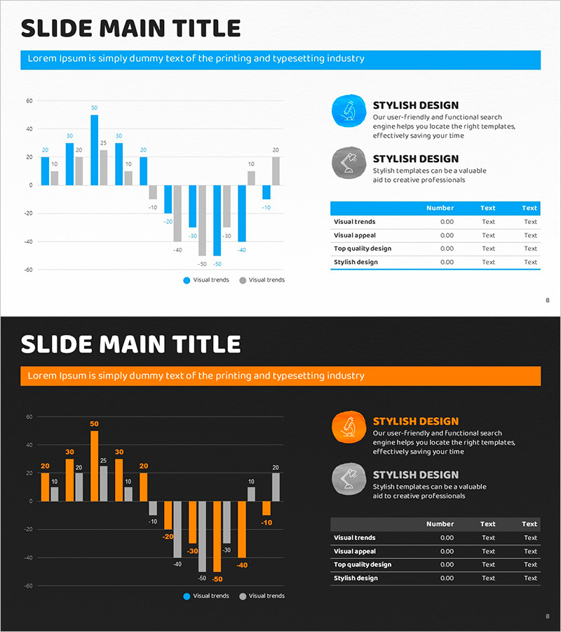
A financial performance visualization PowerPoint slide featuring a dual-series profit and loss chart in blue and orange. The slide combines horizontal bar graphs for revenue and loss comparison with a line graph showing trends, complemented by an information panel on the right side. Delivered in 16:9 PPTX format with 2 slides, this template is ready for immediate use in financial reports, quarterly earnings presentations, investor relations meetings, and executive briefings. Clear numerical labels ensure readability in projection environments, while strong color contrast enhances audience comprehension of complex financial data.
Usage Points
-
Main Usage
Present comprehensive financial performance analysis using multiple chart formats simultaneously. The slide combines horizontal bar graphs for direct P&L comparison with a line graph displaying trends, enabling both static data and dynamic change visualization. Effectively communicates financial health and credibility to investors, executives, and stakeholders.
-
How to Use
Apply this template to financial reports, quarterly earnings presentations, investor relations (IR) meetings, and executive briefings. Replace blue and orange data series with your revenue and loss figures, update numerical labels, and recalculate charts accordingly. The right-side information panel's text and icons are fully editable to match your company's context and messaging.
-
Recommended For
CFOs, financial analysts, executives, investor relations professionals, and accounting teams. Ideal for public company earnings announcements, startup funding pitches, internal management reviews, and quarterly performance assessments. Particularly valuable for financial institutions, consulting firms, manufacturing companies, and retail organizations where financial transparency is critical.
-
Slide Structure
2-slide template featuring horizontal bar graphs (2 series × approximately 8–10 items each), a trend line graph, and a right-side information panel with icons and 3-line text blocks. Blue and orange color coding distinguishes data series, with numerical labels displayed at bar endpoints. Includes title area and slide number footer on each slide.
Related Products
-

Key Financial Indicators Table – Essential Information Visualization
#Financial Plans and Performance #Diagram #Income Statement
-

Paper Theme Key Financial Indicators Slide
#Financial Plans and Performance #Diagram #Income Statement
-

Income Statement Table – Clearly Presenting Financial Plans and Performance
#Financial Plans and Performance #Diagram #Income Statement
-

Visualizing Financial Performance with Business Table Chart – Intuitive and Effective
#Financial Plans and Performance #Diagram #Income Statement
