Orange Highlight Donut Chart – Visualizing Market Share
RJ0500031_24
- Last Update 06/15/2025
- File Size 1.7MB
- # of Slides 2
- File Format PPTX
- Slide Ratio 16:9
- Color
Keywords
About the Product
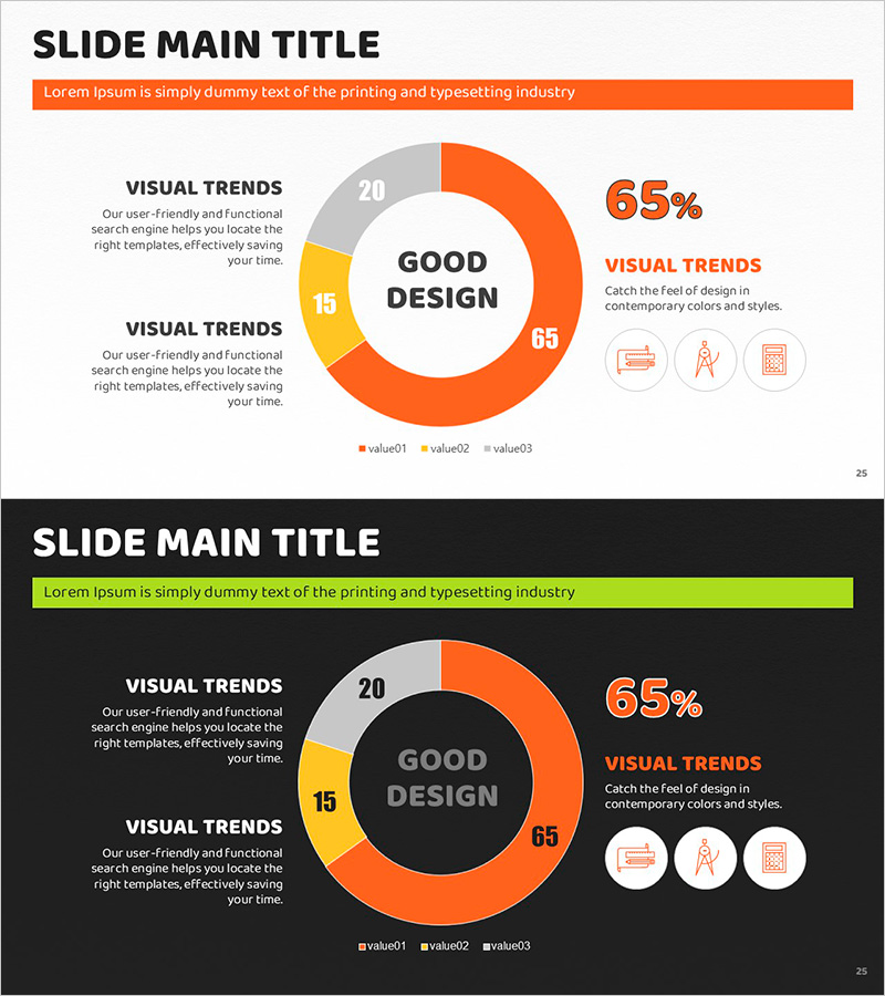
A donut chart PowerPoint slide designed to compare three data categories such as market share, sales ratio, and customer composition at a glance. The design uses orange, yellow, and gray color accents to highlight key segments, with a central circular area for emphasizing core metrics or titles. The 2-slide set is ready for immediate use in various presentation contexts, with fully editable text and numerical values for flexible customization.
Usage Points
-
Main Usage
Clearly express the proportion of each item relative to the whole, such as market share, sales ratio, customer composition, and budget allocation. The central circular area emphasizes key metrics or titles, enabling simultaneous comparison and analysis of three data sets with visual impact.
-
How to Use
Ideal for business reports, marketing plans, investor presentations, and quarterly performance reviews. The orange accent color highlights primary segments, while text labels and numerical values can be freely modified to suit different presentation contexts and data scenarios.
-
Recommended For
Finance and planning teams presenting quarterly performance analysis, marketing teams comparing customer segmentation and channel-based revenue, sales teams reporting regional and product-based sales performance, and executives in strategic meetings and board presentations.
-
Slide Structure
3-series donut chart (orange 65%, yellow 15%, gray 20% example) with central circular emphasis area, right-side numerical display, and left-side text description zone. 2-slide set includes light background and dark background versions.
Related Products
-

Visualizing Market Share with Watercolor Donut Chart
#Market and Competitor Analysis #Graph #Market Share
-

Bottled Beer Donut Chart – Market Share Visualization
#Market and Competitor Analysis #Marketing Plan and Strategy #Graph
-

Analyzing Market Share with Donut Chart – Clean and Stylish Design
#Company Introduction #Market and Competitor Analysis #Graph
-

Avocado Share Chart – Market Status and Competitive Analysis
#Market and Competitor Analysis #Graph #Other
