Granular Numerical Highlight Chart for Market Trends
RJ0500031_10
- Last Update 06/15/2025
- File Size 1.7MB
- # of Slides 2
- File Format PPTX
- Slide Ratio 16:9
- Color
Keywords
About the Product
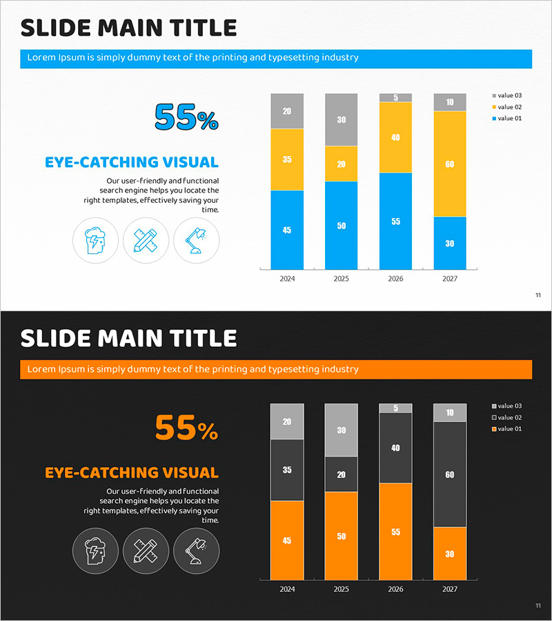
A stacked bar chart PowerPoint slide optimized for market trend analysis and multi-series data comparison. This presentation template displays data across four years (2024–2027) with four distinct data series represented in blue, yellow, gray, and white. Numerical values are embedded directly within each bar segment for precise value comparison. The left side features a key message, headline text, and three supporting icons, while the right side showcases the stacked bar visualization. Two design variations are provided—light background for projector presentations and dark background for online meetings. The 16:9 aspect ratio, 2-slide set is fully editable and ready for immediate use.
Usage Points
-
Main Usage
Visualize multi-series data across time periods or categories in a stacked format, enabling simultaneous comparison of overall trends and component composition. Ideal for displaying market size evolution, revenue breakdown, customer segment distribution, and other complex datasets requiring both aggregate and segmented views.
-
How to Use
Insert this slide into executive reports, business plans, or marketing strategy presentations within the market analysis section. Edit the numerical values to match your data, adjust the number of series as needed, and customize colors to align with your brand. Select the light background for in-person projector presentations or the dark background for virtual meetings and online sharing.
-
Recommended For
Finance professionals, marketing strategists, management consultants, and data analysts presenting market conditions, competitive benchmarking, or performance trends. Effective for quarterly earnings reports, annual growth analysis, product-line revenue composition, and any scenario requiring multi-dimensional numerical comparison.
-
Slide Structure
Left panel contains a 55% metric highlight, section heading 'Eye-Catching Visual,' descriptive text (3 lines), and three circular icons. Right panel displays a stacked bar chart with four year columns (2024–2027) and four data series (blue, yellow, gray, white), with numerical labels embedded in each segment. Legend appears in the upper right corner.
Related Products
-

Trends by Technology Graph – Market and Competitor Analysis
#Market and Competitor Analysis #Graph #Industry Trends
-

Building Market Vertical Accumulation Chart
#Market and Competitor Analysis #Graph #Industry Trends
-

Segmentation Chart for Traditional Buildings – Visualizing Market Trends
#Market and Competitor Analysis #Graph #Industry Trends
-

Key Messages on a Vertical Cumulative Chart
#Business Vision and Strategy #Market and Competitor Analysis #Diagram
