Pie Charts and Mini Illustrations – Visual Data Analysis Tool
RJ0500030_15
- Last Update 06/15/2025
- File Size 0.1MB
- # of Slides 2
- File Format PPTX
- Slide Ratio 16:9
- Color
Keywords
About the Product
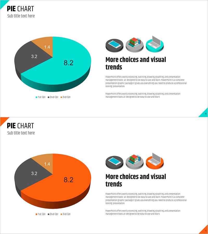
A 2-slide PowerPoint set featuring 3D pie charts that clearly represent data ratios across three categories. The charts use a cyan, orange, and gray color palette with numeric labels on each segment, making data composition immediately visible. Device mockup icons positioned on the right side support multi-channel or platform-based ratio analysis. Ideal for presentations, reports, and marketing decks where you need to communicate market share, customer composition, budget allocation, or sales distribution data effectively.
Usage Points
-
Main Usage
Visualize and communicate data ratios across three categories—such as market share, customer segments, budget distribution, or sales breakdown—in a clear, intuitive format that engages your audience immediately.
-
How to Use
Insert these slides during the data overview section of your presentation or in the composition analysis portion of marketing reports and business documents. Edit the chart values and labels with your own data for immediate use.
-
Recommended For
Marketing managers, sales directors, financial analysts, business planners, and consultants who need to present data-driven insights. Suitable for quarterly performance reports, customer segmentation analysis, and channel-based revenue presentations.
-
Slide Structure
2-slide set. Each slide features a 3D pie chart divided into 3 segments (cyan, orange, gray) with numeric labels, accompanied by a text area on the right. Device mockup icons are positioned to the right of the chart to support multi-channel data representation.
Related Products
-

Graph Charts for Systematic Market Analysis – Bar and Pie Charts
#Technical Approach #Market and Competitor Analysis #Diagram
-

Science Experiment Analysis Circular Graph Table Chart – Innovation in Data Visualization
#Business Introduction #Technical Approach #Diagram
-

Chemical Experiment Analysis Graph Chart – Visualizing R&D Achievements
#Technical Approach #Market and Competitor Analysis #Diagram
-

User Analysis on Coffee and Smoking – Market Trends and Insights
#Market and Competitor Analysis #Graph #Other
