Drone Performance Comparison Analysis Graph – Data Visualization
RJ0400040_8
- Last Update 05/28/2025
- File Size 0.2MB
- # of Slides 2
- File Format PPTX
- Slide Ratio 16:9
- Color
Keywords
- #Content-Based Slides
- #Design-Based Slides
- #Product/Service Introduction
- #Market and Competitor Analysis
- #Graph
- #Development Status
- #Competitive Advantage
- #Circles
- #Pie Chart
- #Doughnut Chart
- #16:9
- #donut pie chart PowerPoint
- #pie chart PowerPoint slide
- #data visualization PPT
- #ratio comparison graph
- #donut chart presentation template
About the Product
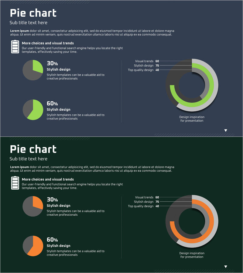
A PowerPoint slide featuring donut-shaped pie charts for intuitive data ratio representation. Composed of two charts in lime green and gray dual-tone color scheme, optimized for ratio comparison and performance analysis. Each slide includes text description areas positioned alongside the charts for immediate presentation use. The donut center accommodates numerical data insertion, making it ideal for marketing analysis, product performance comparison, and market share visualization. Delivered in 16:9 widescreen format with 2-slide composition for versatile presentation scenarios.
Usage Points
-
Main Usage
Visualizes data ratios and compositional proportions through donut-shaped charts. The center space emphasizes key metrics or percentages, making it suitable for product performance comparison, market analysis, and customer satisfaction survey result presentations.
-
How to Use
Double-click the donut chart data on each slide to input values; proportions update automatically. Edit item names and descriptions in text boxes, and adjust colors via the Design tab. Arrange both slides sequentially in your presentation flow or select individual slides as needed.
-
Recommended For
Recommended for marketing professionals, data analysts, sales report writers, and executives preparing management presentations. Effectively communicates ratio-based information such as market share, product preference, budget allocation, and customer segmentation.
-
Slide Structure
2-slide composition. Each slide features a title, descriptive text area, and one donut pie chart. Charts are divided into lime green and gray segments with an editable center space for numerical data. Right-aligned supplementary text areas display additional information (Visual trends, Stylish design, Top quality design, etc.).
Related Products
-

Camera Donut Chart and Table – Market and Competitive Analysis
#Product/Service Introduction #Market and Competitor Analysis #Graph
-

Doughnut Chart for Logistics Performance – Analysis by Transport Method
#Product/Service Introduction #Market and Competitor Analysis #Diagram
-

Visualizing Competitive Advantage with Circular Gauge Charts
#Product/Service Introduction #Market and Competitor Analysis #Graph
-

Competitive Advantage Analysis Diagram – Drive to Market Success
#Product/Service Introduction #Market and Competitor Analysis #Diagram
