Red Green Mockup Chart - Visualizing Investment Returns
RJ0500029_26
- Last Update 06/15/2025
- File Size 1.1MB
- # of Slides 2
- File Format PPTX
- Slide Ratio 16:9
- Color
Keywords
About the Product
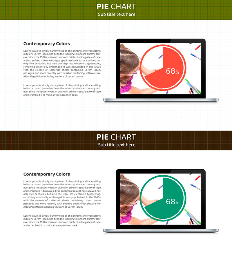
A 2-slide pie chart PowerPoint presentation template for visualizing investment returns and financial performance. The red and green dual-tone color scheme intuitively expresses positive-negative or profit-loss comparisons, while the notebook mockup device display enhances presentation professionalism. Each slide features a layout designed to emphasize specific metrics like 68%, making it immediately applicable for investment performance reports, financial planning presentations, and business performance analysis. Delivered in 16:9 widescreen PPTX format, fully editable across all presentation software platforms.
Usage Points
-
Main Usage
Clearly visualizes ratio-based financial data such as investment returns, financial performance, and business profitability. The contrasting red and green color scheme intuitively distinguishes between positive outcomes and negative results, or target achievement versus shortfall, significantly enhancing audience comprehension.
-
How to Use
Deploy as a key data visualization slide in investment performance reports, quarterly and annual financial results presentations, fund return explanations, and business unit profitability comparisons. The notebook mockup device display creates a contemporary presentation aesthetic ideal for online presentations, webinars, and investor meetings.
-
Recommended For
Finance teams, investment managers, CFOs, business development professionals, fund managers, and consultants who explain data-driven decision-making. Particularly effective for investor meetings, board reports, shareholder meetings, and financial briefings where credibility and professionalism are paramount.
-
Slide Structure
2-slide layout. Each slide features an olive-khaki header section and white content area, with a notebook mockup device positioned on the right displaying a circular pie chart. The chart is segmented into red (approximately 68%) and white-green portions. The left side contains a 'Contemporary Colors' title and descriptive text area to support data interpretation.
Related Products
-

Global Goal Achievement Rate Visualization – Insights Through Market Analysis
#Company Introduction #Market and Competitor Analysis #Graph
-

Sailing Travel Project Expected Return on Investment Design Chart
#Product/Service Introduction #Financial Plans and Performance #Graph
-

Gender Ratio Customer Analysis 3D Circle Graph – Insights for Market Understanding
#Market and Competitor Analysis #Graph #Other
-

Pie Chart Slide for Status of Service Technology Development
#Product/Service Introduction #Market and Competitor Analysis #Graph
