Effort and Performance Table Chart – Optimizing Operational Planning
RJ0500028_27
- Last Update 06/14/2025
- File Size 1.3MB
- # of Slides 2
- File Format PPTX
- Slide Ratio 16:9
- Color
Keywords
- #Content-Based Slides
- #Design-Based Slides
- #Operational Plan
- #Diagram
- #Capital Investment Plan
- #Post-Implementation Management & Maintenance
- #Table
- #Standard Table
- #16:9
- #comparison table chart PowerPoint
- #data table slide template
- #operational planning slide
- #performance analysis chart
- #effort vs results table
About the Product
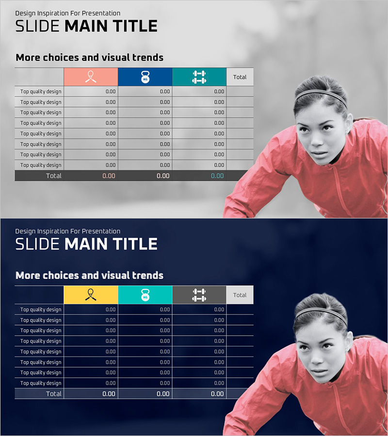
A three-column comparison table PowerPoint slide designed to analyze operational planning efficiency visually. This slide structure compares effort input and performance outcomes across multiple line items, using distinct header colors—coral pink, navy blue, and teal—against a neutral gray background for optimal data readability. The template includes two slide variations: a light background version and a dark background version, allowing you to select the most suitable design for your presentation environment. Each row accommodates quantitative metrics, enabling teams to compare resource investment against actual results at a glance. Ideal for operational reviews, performance analysis, resource allocation planning, and strategic efficiency assessments in business presentations.
Usage Points
-
Main Usage
Used during operational planning phases to compare resource investment (effort) against expected outcomes (performance) across multiple line items, enabling efficiency evaluation. Supports data-driven decision-making in team meetings, executive briefings, and performance review sessions.
-
How to Use
Enter resource inputs—labor, time, budget—in the 'Effort' column and expected results in the 'Performance' column for each line item. Calculate totals in the summary row to identify optimization opportunities. Choose between the light or dark background version based on your presentation venue and display equipment.
-
Recommended For
Operations, planning, and finance professionals conducting quarterly or annual operational plan reviews. Project managers evaluating resource allocation efficiency, and executives monitoring organizational performance relative to resource investment will find this template particularly useful.
-
Slide Structure
A structured table with 3 columns (Effort, Performance, Total) and 8 data rows plus 1 summary row. Column headers are color-coded in coral pink, navy blue, and teal for visual distinction. Data rows feature a consistent gray background. Both slides maintain identical table structure with only background color variation.
Related Products
-

Facility Management Plan Chart – Optimizing Operations and Investments
#Operational Plan #Diagram #Capital Investment Plan
-

Blue Orange Checklist – Diagram for Operational Planning
#Operational Plan #Diagram #Capital Investment Plan
-

KPI Expansion Diagram for Facility Management – Visualizing Key Management Metrics
#Operational Plan #Diagram #Capital Investment Plan
-

Process Timeline and Resource Table – Optimizing Operational Plans
#Operational Plan #Diagram #Capital Investment Plan
