KPI Expansion Diagram for Facility Management – Visualizing Key Management Metrics
RB0100037_8
- Last Update 03/05/2025
- File Size 4.6MB
- # of Slides 2
- File Format PPTX
- Slide Ratio 4:3
- Color
Keywords
- #Content-Based Slides
- #Design-Based Slides
- #Operational Plan
- #Diagram
- #Capital Investment Plan
- #Post-Implementation Management & Maintenance
- #Cluster
- #Spread
- #Closed Cluster Diagram
- #Centralized Diagram
- #4:3
- #radial expansion diagram PowerPoint
- #KPI visualization slide
- #central hub diagram template
- #facility management presentation
- #operational planning PowerPoint
- #how to create expansion diagram in PowerPoint
About the Product
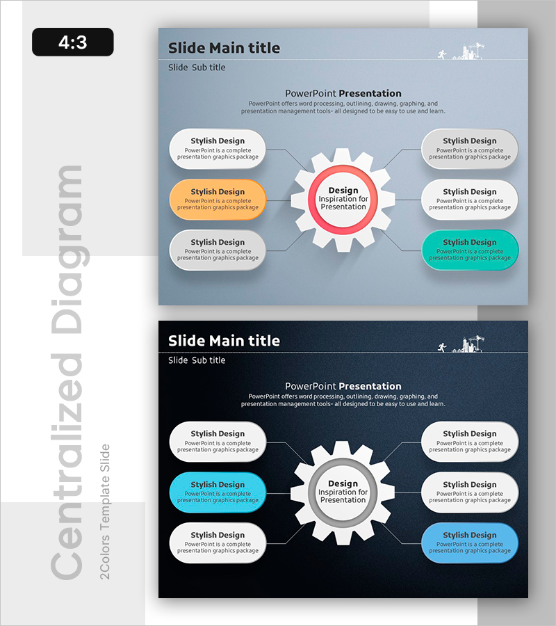
A PowerPoint slide featuring a radial expansion diagram that visualizes key performance indicators (KPIs) radiating from a central hub. The design places a red circular node at the center with six connected speech bubble text boxes extending outward, making it ideal for facility management, operational planning, and performance reporting. Set against a light gray background with white, orange, and turquoise accent nodes, the layout uses connecting lines and arrows to clearly show relationships between the central theme and supporting elements. The 4:3 aspect ratio, 2-slide template is fully editable and ready for immediate use in presentations, reports, and business communications.
Usage Points
-
Main Usage
Visualize organizational KPIs and key management metrics by radiating from a central hub, making strategic objectives and operational elements immediately clear. Ideal for facility management, project oversight, and business operations to show how core themes connect to supporting initiatives and performance areas.
-
How to Use
Enter your main topic (e.g., Facility Management, Operational Goals) in the central red circle, then add supporting items (e.g., Safety, Cost Reduction, Efficiency) in the six surrounding speech bubbles. Customize colors, text, and connecting lines to match your presentation style and use for quarterly planning, strategy reviews, and performance reports.
-
Recommended For
Facility and property managers, operations planners, project managers, executive presenters, training facilitators, and business analysts who need to communicate core KPIs and strategic initiatives with clear visual hierarchy and relationships.
-
Slide Structure
2-slide template in 4:3 aspect ratio PPTX format. Slide 1: Light gray background with central red circular node connected to 6 speech bubble text boxes (white, orange, turquoise accents) in radial layout. Slide 2: Dark gray background with identical structure using white and turquoise nodes for contrast variation. All elements fully editable for customization.
Related Products
-

Key Features of the Network Platform – Innovative Equipment Investment Plan
#Operational Plan #Diagram #Capital Investment Plan
-

Management System Diagram – Operating Plan Visualization
#Operational Plan #Diagram #Capital Investment Plan
-

Equipment and Maintenance Support Plan Template – Cluster Diagram Emphasizing Operational Planning
#Operational Plan #Diagram #Capital Investment Plan
-

Design Closed Diagram PowerPoint Template
#Product/Service Introduction #Operational Plan #Diagram
