Graph Ratio by Subject – Education Market Analysis
RJ0500027_9
- Last Update 06/14/2025
- File Size 1MB
- # of Slides 2
- File Format PPTX
- Slide Ratio 16:9
- Color
Keywords
- #Content-Based Slides
- #Design-Based Slides
- #Market and Competitor Analysis
- #Graph
- #Market Share
- #Industry Trends
- #Horizontal Bar
- #Circles
- #Segmented Horizontal Bar
- #Pie Chart
- #16:9
- #pie chart PowerPoint slide
- #circular graph presentation
- #market analysis chart
- #education market data visualization
- #4-segment pie chart
- #ratio graph PowerPoint template
About the Product
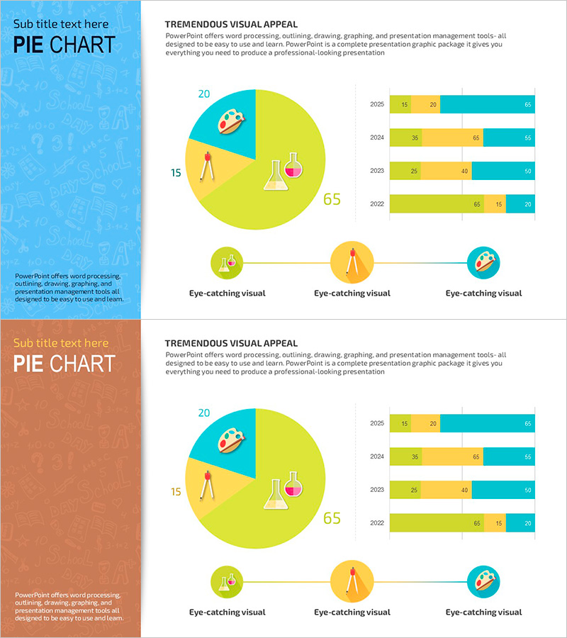
A 4-segment pie chart PowerPoint slide designed for education market analysis presentations. The circular graph in lime green and turquoise colors intuitively displays market share by subject, while the horizontal bar chart on the right visualizes year-over-year trends. This PPT slide template effectively communicates market data in education-related presentations and is ready to use with simple data input.
Usage Points
-
Main Usage
Visualize education market analysis, compare market share by subject, and display market trends over time. The pie chart shows overall composition while the bar graph illustrates temporal changes, providing comprehensive market insights.
-
How to Use
Apply to education business presentations, market research reports, and educational institution marketing materials. Simply replace the slide values and labels with your data for immediate use, with easy color customization options.
-
Recommended For
Education institution staff, education business planners, market analysts, education consultants. Ideal for presentations where quantitative data must be clearly communicated to audiences.
-
Slide Structure
Slide 1: Lime green background with 4-segment pie chart (20, 15, 65, other percentages) + 3 icons / Slide 2: Orange background with identical pie chart + 4 year horizontal bar graphs (2025–2022) with 3-series color differentiation
Related Products
-

Development Status Analysis Pie & Bar Chart – Market Share Visualization
#Product/Service Introduction #Market and Competitor Analysis #Graph
-

Male and Female Real Estate Holding Status Graph – Market Share at a Glance
#Market and Competitor Analysis #Graph #Market Share
-

Red Green Detail Analysis Chart – Visualizing Market Share
#Market and Competitor Analysis #Graph #Market Status
-

Visualizing Market Share with Pie Chart – Insights and Strategies
#Market and Competitor Analysis #Graph #Market Share
