Green Red Line Graph Trend – Visualization for Market Analysis
RJ0500025_19
- Last Update 06/13/2025
- File Size 0.4MB
- # of Slides 2
- File Format PPTX
- Slide Ratio 16:9
- Color
Keywords
About the Product
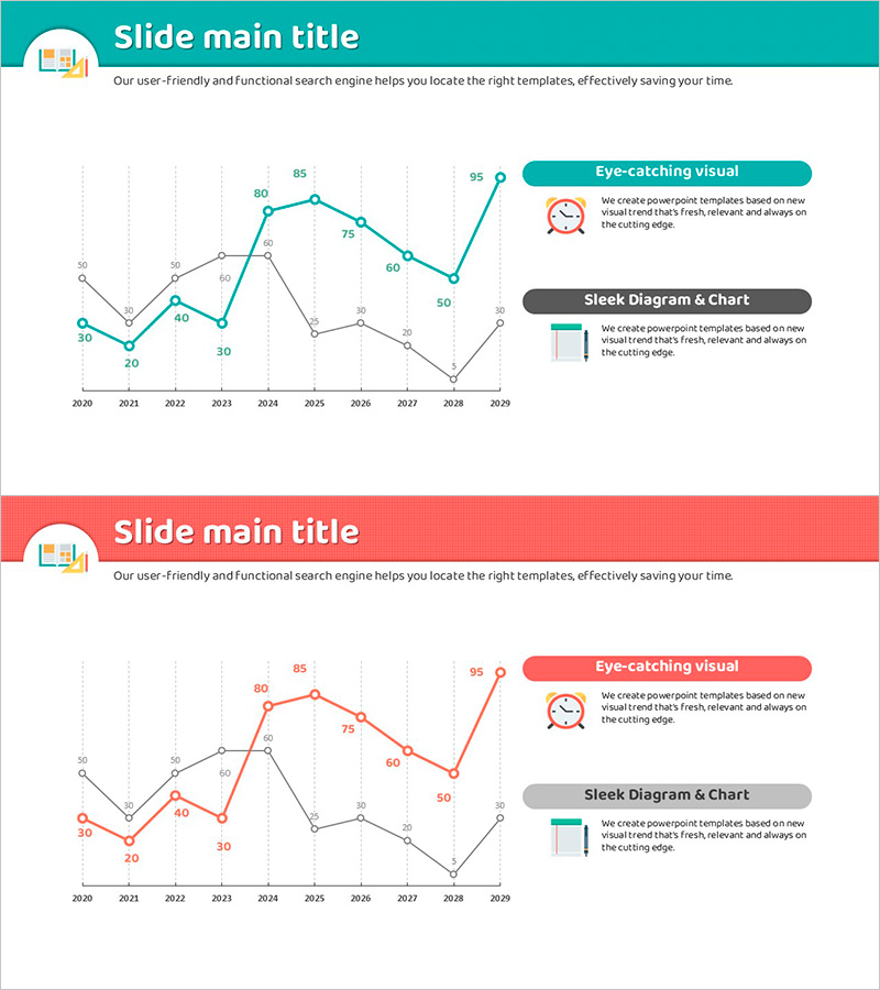
A dual-series line chart PowerPoint slide designed for market trend and competitive analysis presentations. The slide visualizes two data series in teal and red across a 10-year period (2020-2029), with data point labels for precise value comparison. The grid background ensures clarity and readability, making it ideal for business reports, sales presentations, and strategic analysis. Use this slide to display market growth rates, revenue trends, competitive metrics, or performance benchmarks. The 16:9 widescreen format includes 2 fully editable slides ready for immediate customization with your own data.
Usage Points
-
Main Usage
Visualize two or more data series over time to clearly display trend changes, growth patterns, and correlations between market dynamics, sales performance, or competitive positioning.
-
How to Use
Insert this slide into business reports, marketing plans, investor presentations, and quarterly reviews. Replace the sample data points and labels with your actual metrics. The grid structure and dual-color design support easy interpretation during live presentations.
-
Recommended For
Executives, marketing managers, financial analysts, consultants, and sales teams presenting quarterly reports, strategic reviews, client pitches, and performance dashboards requiring trend-based insights.
-
Slide Structure
Two line series (teal and red), 10 time-axis points (2020-2029), numeric labels at each data point, grid background, legend indicator. Left Y-axis scale (0-95), right-side information area with callout boxes for key messages.
Related Products
-

Future Technology Industry Analysis Graph – Market Trends and Growth Prediction
#Market and Competitor Analysis #Diagram #Graph
-

Annual Growth Trends in Child Development
#Market and Competitor Analysis #Graph #Future Outlook
-

Line Graph and Key Messages – Market Outlook Analysis
#Market and Competitor Analysis #Graph #Future Outlook
-

Eco-friendly Business Future Outlook Line Graph – Market Analysis
#Market and Competitor Analysis #Graph #Future Outlook
