Visual Data Analysis with Simple Triple Pie Chart – Design and Intuition
RJ0500024_7
- Last Update 06/13/2025
- File Size 1.8MB
- # of Slides 2
- File Format PPTX
- Slide Ratio 16:9
- Color
Keywords
About the Product
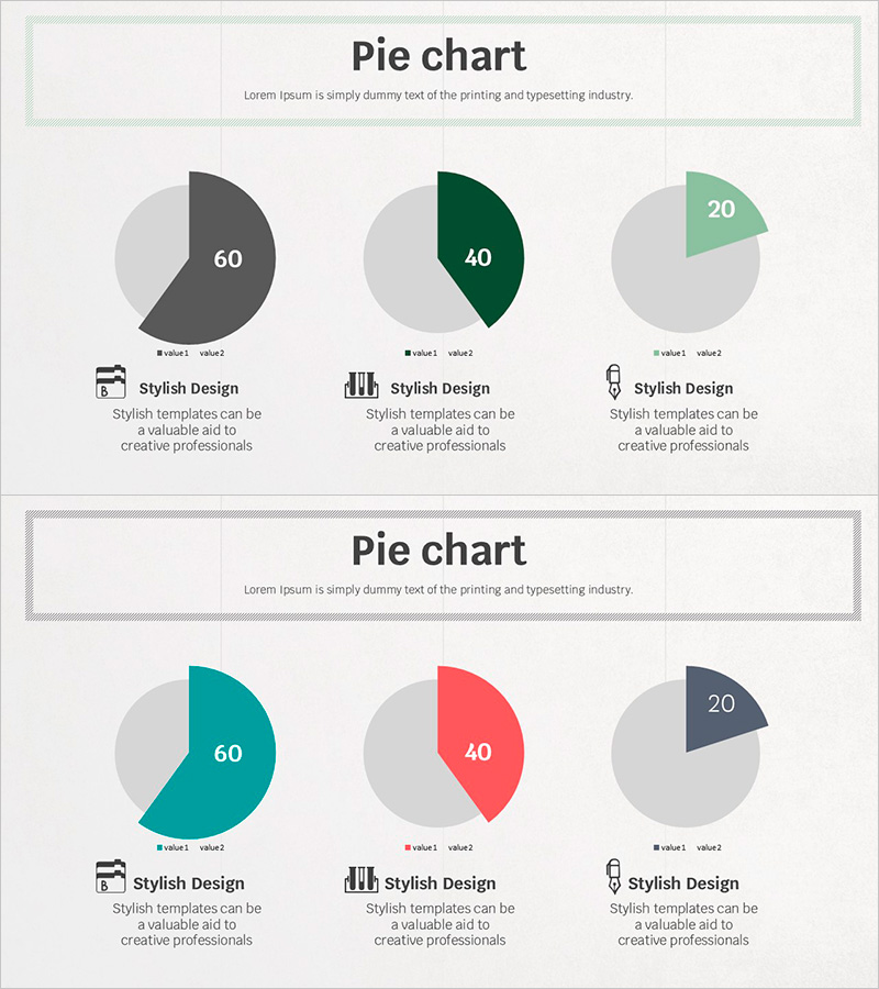
A PowerPoint slide featuring three pie charts arranged horizontally to compare multiple data categories simultaneously. Each chart is divided into two segments to display proportional relationships intuitively. The first set uses charcoal, forest green, and mint accent colors, while the second set applies teal, coral, and sage tones to visually distinguish data series. Icons and descriptive text are positioned below each chart for immediate use in presentations, reports, and analytical materials. The 2-slide template is optimized for 16:9 widescreen format and ready for data customization.
Usage Points
-
Main Usage
Display and compare proportional data across multiple categories on a single slide. Ideal for presenting market share, budget allocation, customer demographics, product sales distribution, and other compositional metrics. Distinct accent colors for each chart enable clear differentiation between data series.
-
How to Use
Insert this slide in the analysis or results section of your presentation to explain multiple ratio-based metrics simultaneously. Edit the chart values with your actual data, customize the icons and legend text to match your presentation context, and apply your data labels. The color scheme is pre-applied, requiring no additional design work.
-
Recommended For
Recommended for financial analysts, marketing strategists, business managers, and executives preparing financial reports, strategic presentations, investment pitches, and business analyses. Effectively communicates data-driven insights and comparative metrics.
-
Slide Structure
2-slide template. Each slide displays 3 pie charts arranged horizontally, with each chart divided into 2 segments (value1 and value2). Slide 1 uses charcoal, forest green, and mint color combinations; Slide 2 features teal, coral, and sage tones. Icons and text description areas are positioned below each chart for context and labeling.
Related Products
-

Bar Chart of Key Segments – Data Analysis and Performance Visualization
#Business Introduction #Graph #Horizontal Bar
-

Global Architectural Donut Chart – Market Share Visualization
#Market and Competitor Analysis #Graph #Other
-

Business Trends Chart - Suitable for Strategic Planning
#Graph
-

Current Status of School Violence from Data – Utilizing Bar Graphs
#Market and Competitor Analysis #Graph #Market Analysis
