Highlighted Bell Graph for Visualizing Market Analysis Data
RJ0500016_18
- Last Update 06/11/2025
- File Size 0.2MB
- # of Slides 2
- File Format PPTX
- Slide Ratio 16:9
- Color
Keywords
About the Product
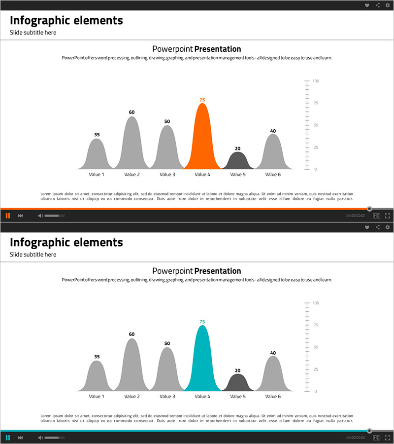
A specialized bell curve PowerPoint slide designed for market analysis and competitive advantage presentations. This slide features a distribution chart comparing six data points with one value highlighted in orange or teal to emphasize key insights. The layout includes a title section at the top, a centered bell curve with labeled values, a Y-axis scale (0-100) on the right, and descriptive text space at the bottom. Perfect for business presentations, market analysis reports, investment pitches, and statistical data visualization. Created in 16:9 widescreen format and fully editable in PPTX.
Usage Points
-
Main Usage
Visualize market analysis, competitive positioning, and data distribution using a professional bell curve chart. The highlighted color emphasis draws attention to critical data points, making complex statistical information accessible to your audience. Ideal for presenting market trends, performance distributions, customer segmentation, and comparative analysis.
-
How to Use
Enter your analysis title in the top section. Replace the chart values with your actual data points and adjust the Y-axis scale as needed. Keep the highlight color on your key data point while maintaining gray for supporting values. Add your analytical insights and conclusions in the bottom text area to complete the narrative.
-
Recommended For
Marketing professionals, data analysts, business executives, and investment relations specialists. Recommended for market overview presentations, competitive benchmarking, customer satisfaction analysis, sales performance reporting, and statistical research findings.
-
Slide Structure
Two-slide set with identical layouts: title area (single line), centered bell curve chart (six labeled data points with one highlighted), Y-axis scale (0-100 range), and descriptive text section (3-4 lines). First slide features orange highlight; second slide uses teal highlight for flexible presentation scenarios.
Related Products
-

Office Interior Analysis Graph - Visualizing Competitive Advantage
#Market and Competitor Analysis #Graph #Market Analysis
-

Modern Blue Template for Visualizing Market Competitiveness with Bar Chart
#Market and Competitor Analysis #Graph #Market Analysis
-

Circular Gradient Wide Template Bundled Charts
#Market and Competitor Analysis #Graph #Market Analysis
-

Scientific Research Results Graph – A Tool for Market Analysis and Competitive Advantage
#Market and Competitor Analysis #Graph #Market Analysis
