Horizontal Segmentation Bar Graph for Market Analysis – Competitive Advantage Structure
RJ0500005_15
- Last Update 06/08/2025
- File Size 0.2MB
- # of Slides 2
- File Format PPTX
- Slide Ratio 16:9
- Color
Keywords
- #Content-Based Slides
- #Design-Based Slides
- #Market and Competitor Analysis
- #Graph
- #Market Analysis
- #Competitive Advantage
- #Horizontal Bar
- #Segmented Horizontal Bar
- #16:9
- #horizontal segmented bar chart PowerPoint
- #market analysis presentation slide
- #competitive advantage chart
- #4-series bar graph
- #comparison analysis template
- #PowerPoint chart slide design
About the Product
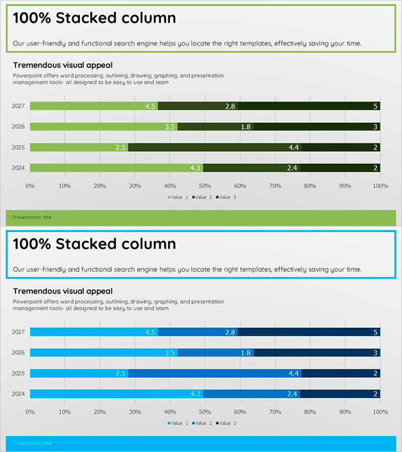
A horizontal segmented bar chart PowerPoint slide designed to visualize market analysis and competitive advantage positioning. This presentation template displays four data series in horizontal format, enabling clear comparison of composition ratios across multiple categories. The green and black color scheme differentiates primary metrics from supporting data, making it ideal for business reports and investor presentations. The 16:9 widescreen format with 2-slide layout allows you to present diverse market data and competitive benchmarking information effectively.
Usage Points
-
Main Usage
This slide visualizes multi-series data such as market size, competitor market share, and product revenue distribution in horizontal bar format. The composition ratio of each category is instantly recognizable, making it highly effective for market overview presentations and competitive strategy discussions.
-
How to Use
Insert this slide into the market analysis section of business plans, marketing proposals, or investor pitch decks. Enter actual figures and category labels into each bar segment, and adjust colors as needed to highlight key insights. The 2-slide layout accommodates additional data or detailed analysis on subsequent slides.
-
Recommended For
Marketing managers, strategic planning teams, and sales executives benefit from this template when presenting market conditions and competitive positioning. It is particularly valuable for B2B proposals, quarterly performance reports, and new business initiative presentations where data credibility is essential.
-
Slide Structure
Two slides featuring horizontal segmented bar charts with 4 data series each. Each bar is divided by category (year, product, region, etc.), with green series representing primary indicators and black series showing supporting information. Legend and numerical labels are included to facilitate data interpretation.
Related Products
-

Segmented Bar Graph for Market Competition Analysis – Data-Driven Insights
#Market and Competitor Analysis #Graph #Market Analysis
-

Segmented Bar Graph for Market Analysis Visualization
#Market and Competitor Analysis #Graph #Market Analysis
-

Touch Wide Slide Template – Segmentation Graph Usage
#Market and Competitor Analysis #Graph #Industry Trends
-

Robot Market Analysis Bar Chart – Competitive Data Visualization
#Market and Competitor Analysis #Graph #Competitor Analysis
