Comparison Stacked Graph by Year – Market Trends Analysis
RJ0500009_14
- Last Update 06/09/2025
- File Size 0.3MB
- # of Slides 2
- File Format PPTX
- Slide Ratio 16:9
- Color
Keywords
- #Content-Based Slides
- #Design-Based Slides
- #Market and Competitor Analysis
- #Graph
- #Industry Trends
- #Horizontal Bar
- #Segmented Horizontal Bar
- #16:9
- #stacked bar chart PowerPoint
- #horizontal stacked graph template
- #year-over-year comparison slide
- #market trends analysis PPT
- #data visualization slide download
About the Product
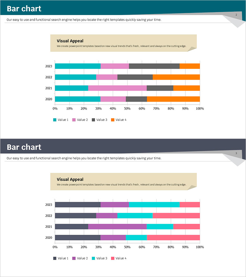
A stacked bar chart PowerPoint slide designed for comparing market trends across multiple years and data series. This presentation template visualizes data from 2020 to 2023 using four distinct color-coded series: teal, pink, gray, and orange. The horizontal 100% stacked format allows viewers to instantly grasp both the overall magnitude changes and the proportional shifts of individual components over time. Ideal for business reports, market analysis presentations, competitive benchmarking, and sales channel breakdowns that require multi-series data visualization.
Usage Points
-
Main Usage
Designed to simultaneously display year-over-year market trend changes and the proportional composition of each data series. The stacked format enables viewers to compare both total magnitude and individual component ratios at a glance, making it ideal for market analysis, competitive benchmarking, and sales channel composition reporting.
-
How to Use
Input your data for each year, and the stacked bars automatically adjust. The four series colors can be customized to match your corporate branding. The legend clearly identifies each data series. Simply insert into business reports, marketing plans, or investor presentations and update with your own figures.
-
Recommended For
Market analysts, marketing managers, sales directors, and business executives preparing trend reports. Particularly useful for year-over-year trend analysis, competitive market share comparison, sales channel revenue breakdown, and customer segment growth rate analysis across multiple data categories.
-
Slide Structure
Two-slide template featuring a title slide with teal header background and a data visualization slide with a 4-series stacked bar chart. The chart displays data for years 2020–2023 with color-coded series (teal, pink, gray, orange), horizontal 0–100% axis, year labels, and legend.
Related Products
-

100% Stacked Bar Chart Abstract Pattern Presentation
#Market and Competitor Analysis #Graph #Other
-

Bar Chart for Eco-friendly Practices Trends Visualization
#Market and Competitor Analysis #Graph #Industry Trends
-

Stacked Bar Graph for Growing Market Trends – Business Strategy
#Business Strategy #Market and Competitor Analysis #Graph
-

Memorable Travel Destinations Survey Slide – Market and Competitive Analysis
#Market and Competitor Analysis #Graph #Industry Trends
