Donut Chart for Comparing Research Analysis Results
RJ0500007_14
- Last Update 06/09/2025
- File Size 1.2MB
- # of Slides 2
- File Format PPTX
- Slide Ratio 16:9
- Color
Keywords
- #Content-Based Slides
- #Design-Based Slides
- #Product/Service Introduction
- #Technical Approach
- #Graph
- #Development Status
- #Research and Development
- #Circles
- #Doughnut Chart
- #16:9
- #doughnut chart PowerPoint
- #donut graph presentation slide
- #comparison analysis chart
- #pie chart template
- #data visualization PPT
About the Product
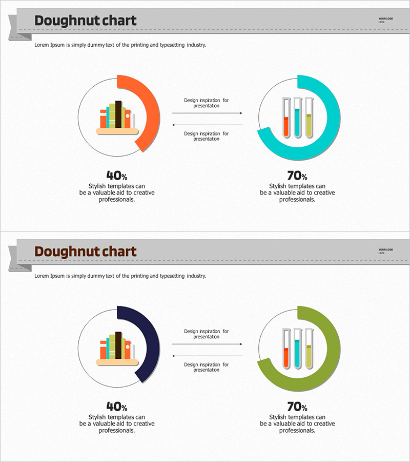
A doughnut chart PowerPoint slide designed to visually compare research analysis results. This 2-slide presentation features two color schemes—orange and turquoise—clearly representing 40% and 70% data ratios. Each doughnut chart includes a centered icon (bar graph and test tube) to intuitively convey data meaning. Bidirectional arrows between the two results illustrate relationships and transitions. Design inspiration text areas are included for immediate presentation use. The 16:9 widescreen PPTX format is fully editable in all modern PowerPoint versions.
Usage Points
-
Main Usage
Present quantitative research data or analysis results from two perspectives side-by-side. The centered icons in each doughnut clearly distinguish data categories, while bidirectional arrows express causal relationships or trend changes between the two results. Ideal for academic presentations, research reports, and business analysis materials.
-
How to Use
Replace the doughnut chart percentages (40%, 70%) with your own data values. Swap the centered icons to match your field or category. Fill in the arrow-adjacent text area with insights about the relationship between the two results. Apply color changes globally using PowerPoint's theme color feature to maintain design consistency.
-
Recommended For
Graduate students, researchers, data analysts, marketing professionals, and business executives presenting quantitative findings. Recommended for academic conference presentations, executive briefings, consulting proposals, and market research result presentations where parallel comparison of two scenarios or outcomes is essential.
-
Slide Structure
2-slide layout. Each slide features two doughnut charts (left and right) connected by a centered bidirectional arrow. The left doughnut is orange; the right is turquoise. Each doughnut has a centered icon insertion area. Below are data percentage labels and design inspiration text input zones for customization.
Related Products
-

Light Bulb Science Donut Chart – Clarity in Information Delivery
#Product/Service Introduction #Technical Approach #Graph
-

Blue Pink Circle Graph & Table Chart – Slide Highlighting Visual Appeal
#Product/Service Introduction #Operational Plan #Technical Approach
-

Donut Chart of Pharmaceutical Ingredient Composition
#Product/Service Introduction #Technical Approach #Graph
-

Science Experiment Analysis Circle Graph Table Chart – Technological Advancement
#Product/Service Introduction #Technical Approach #Diagram
