Orange Green 4 Pie Charts – Technology Status and Development
RJ0500006_5
- Last Update 06/08/2025
- File Size 0.6MB
- # of Slides 2
- File Format PPTX
- Slide Ratio 16:9
- Color
Keywords
- #Content-Based Slides
- #Design-Based Slides
- #Product/Service Introduction
- #Business Introduction
- #Graph
- #Development Status
- #Technological Status
- #Circles
- #Pie Chart
- #16:9
- #pie chart PowerPoint slide
- #circular chart presentation
- #data visualization slide
- #technology status template
- #4-item comparison chart
About the Product
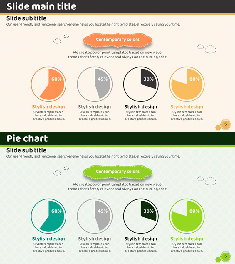
A two-slide PowerPoint presentation featuring four pie charts to visualize technology status and development stages. Each chart displays data in distinct colors—orange, green, gray, and black—representing 60%, 45%, 30%, and 80% respectively. Below each chart, a text area provides context and explanation. This slide deck is ideal for product introductions, technology status analysis, market share comparisons, and performance metrics. The 16:9 widescreen format ensures compatibility with modern projectors and online presentations.
Usage Points
-
Main Usage
Display and compare four independent data series simultaneously, each represented as a percentage-based pie chart. The slides enable clear visualization of technology metrics, product capabilities, market share, or performance indicators across multiple categories.
-
How to Use
Apply this template to product launch presentations showing technology stack distribution, market analysis sections in marketing plans, performance metrics in business reports, or technology seminars analyzing current status. Customize the text areas below each chart with category names and detailed explanations to enhance audience comprehension.
-
Recommended For
Technology managers, product managers, marketing strategists, and executives presenting data-driven analysis. Particularly effective when comparing four or more independent data series that require simultaneous visualization and clear differentiation.
-
Slide Structure
Two-slide deck with a 2×2 grid layout of pie charts on each slide. Each chart displays a percentage value in the center and includes a title and description text area below. Color differentiation—orange, green, gray, and black—provides clear visual distinction between data series.
Related Products
-

Smartwatch Product Technology and Development Status – Innovation and Advancement
#Product/Service Introduction #Business Introduction #Diagram
-

Infographic Slide for Performance Analysis – Clear Visualization
#Product/Service Introduction #Business Introduction #Graph
-

Pie Chart for Market Share Analysis – Effective Data Visualization
#Product/Service Introduction #Market and Competitor Analysis #Graph
-

Progress Status Order Circle Graph – Visualizing Project Progress
#Product/Service Introduction #Business Introduction #Diagram
