Market Share Analysis with 3 Simple Pie Charts
RJ0500005_13
- Last Update 06/08/2025
- File Size 0.2MB
- # of Slides 2
- File Format PPTX
- Slide Ratio 16:9
- Color
Keywords
About the Product
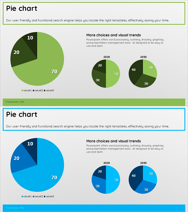
A professional pie chart PowerPoint slide designed for market share analysis and competitive comparison. This 2-slide presentation features a green and blue color scheme with one main pie chart and two year-over-year comparison charts (2028 and 2030) that clearly visualize the proportion of three data segments. The 16:9 widescreen PPTX format is fully editable and ready to use in marketing strategy presentations, business reports, investor pitches, and competitive analysis decks. Each slide includes a title area, pie charts with percentage labels, legend, and descriptive text for comprehensive data storytelling.
Usage Points
-
Main Usage
Visualize the proportional relationship of three data categories such as market share, sales distribution, or customer composition using pie charts. The combination of a main chart and year-over-year comparison charts effectively communicates data trends and changes over time.
-
How to Use
Use in marketing strategy presentations, business reports, investor pitches, executive briefings, and market analysis decks to explain competitive positioning and market share evolution. Simply replace the chart values and legend labels with your own data for immediate deployment.
-
Recommended For
Marketing managers, executives, business planners, sales directors, and market analysts who need to present competitive comparisons and market performance. Ideal for quarterly or annual market share reporting and strategic planning presentations.
-
Slide Structure
Slide 1: Title area + 3-segment pie chart (70%, 20%, 10% distribution) + legend (value01, value02, value03) + descriptive text. Slide 2: Title area + two comparison pie charts for 2028 and 2030 (each 3-segment) + legend + text. Green and blue gradient color scheme differentiates segments, with percentage labels displayed directly on charts.
Related Products
-

Market Share Analysis Graph & Table – Enhancing Understanding through Data Visualization
#Product/Service Introduction #Market and Competitor Analysis #Diagram
-

Development Status Pie Chart – Visualizing Market Share
#Product/Service Introduction #Market and Competitor Analysis #Graph
-

Carbon Neutral Customer Survey Pie Chart
#Market and Competitor Analysis #Graph #Market Status
-

Development Status Pie Chart – Visualizing Product Progress
#Product/Service Introduction #Market and Competitor Analysis #Graph
