4 Donut Charts for Data Visualization – Easy Presentation Template
RJ0500004_6
- Last Update 06/08/2025
- File Size 1.8MB
- # of Slides 2
- File Format PPTX
- Slide Ratio 16:9
- Color
Keywords
- #Content-Based Slides
- #Design-Based Slides
- #Product/Service Introduction
- #Market and Competitor Analysis
- #Graph
- #Development Status
- #Market Share
- #Circles
- #Pie Chart
- #16:9
- #donut chart PowerPoint slide
- #pie chart presentation template
- #data visualization slides
- #ratio comparison chart
- #percentage data PowerPoint
About the Product
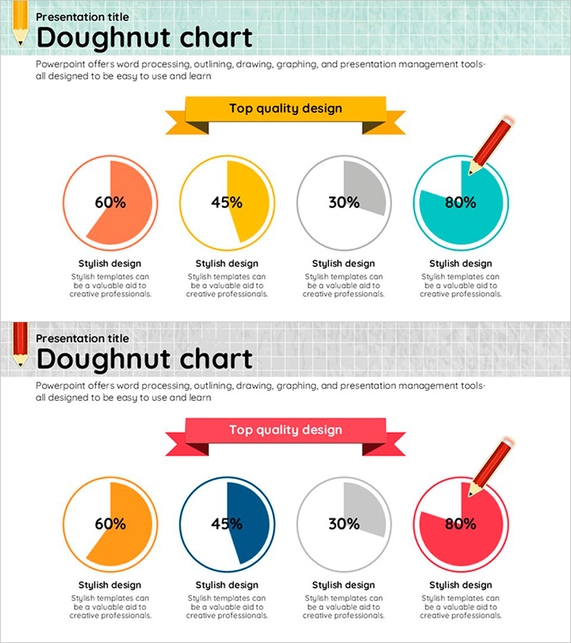
A PowerPoint slide featuring 4 donut charts for comparing multiple data ratios at a glance. Each chart is displayed in distinct color schemes—orange, yellow, gray, and teal on the first slide; orange, navy, gray, and pink on the second. Percentage values are clearly centered within each donut ring. The 2-slide set includes yellow and red ribbon banners respectively, making it adaptable to various presentation contexts. Ideal for market analysis, service introductions, performance reports, and any presentation requiring intuitive quantitative data visualization.
Usage Points
-
Main Usage
Simultaneously compare four data categories expressed as percentages—such as market share, customer satisfaction, sales distribution, or budget allocation. Each donut chart's center displays numerical values, enabling clear communication of quantitative information across multiple metrics.
-
How to Use
Apply to business reports, marketing plans, investor pitch decks, and quarterly performance presentations where multiple data items require parallel comparison. The ribbon banner colors (yellow/red) allow for section differentiation or time-period comparisons.
-
Recommended For
Marketing managers, financial analysts, business planners, and sales directors who need to explain data-driven decisions. Particularly effective when presenting four or more category ratios simultaneously to stakeholders.
-
Slide Structure
2-slide set. Slide 1: Yellow ribbon banner + 4 donut charts in orange, yellow, gray, and teal (displaying 60%, 45%, 30%, 80% respectively). Slide 2: Red ribbon banner + 4 donut charts in orange, navy, gray, and pink (same percentages). Each chart includes descriptive text area below.
Related Products
-

Pie Chart for Market Share Analysis – Effective Data Visualization
#Product/Service Introduction #Market and Competitor Analysis #Graph
-

Development Status Pie Chart – Efficient Data Delivery
#Product/Service Introduction #Market and Competitor Analysis #Graph
-

Pie Chart for Learning Progress – Optimizing Data Visualization
#Product/Service Introduction #Market and Competitor Analysis #Graph
-

Development Status Pie Chart – Visualizing Product Progress
#Product/Service Introduction #Market and Competitor Analysis #Graph
