AI Neon Rhombus Visual Template – KPI Metrics Visualization
RJ0400076_7
- Last Update 06/07/2025
- File Size 2.8MB
- # of Slides 2
- File Format PPTX
- Slide Ratio 16:9
- Color
Keywords
About the Product
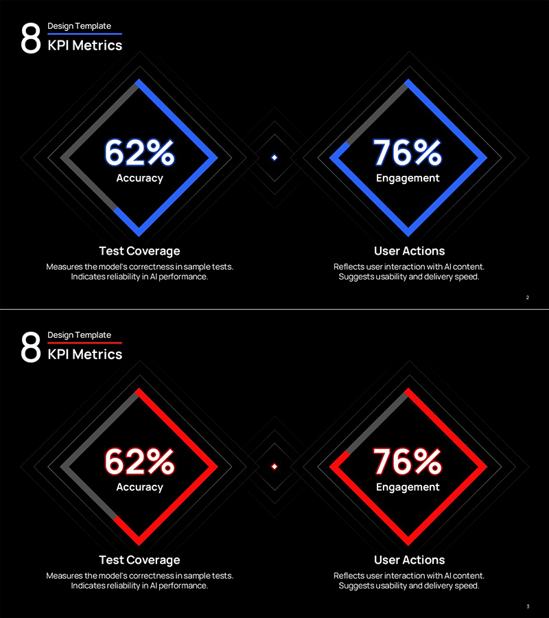
A high-impact PowerPoint slide template for AI-driven KPI visualization using rotated rhombus frames. This 2-slide deck features neon blue and neon red color variants, enabling simultaneous display of four critical metrics: accuracy, engagement, test coverage, and user actions. The multi-layered rhombus geometry with high-contrast typography creates visual emphasis ideal for data-driven presentations. Fully editable and ready for immediate use in performance reports, technical briefings, and executive dashboards.
Usage Points
-
Main Usage
Designed for AI performance evaluation, KPI measurement, and business metrics visualization with maximum visual impact. The rhombus frame layout simultaneously displays four critical indicators—accuracy, engagement, test coverage, and user actions—making it ideal for data-driven decision-making presentations.
-
How to Use
Deploy in product performance reports, technical presentations, investor pitches, and quarterly business reviews as the KPI section. Simply input metrics and labels into each rhombus area for instant completion. Choose between neon blue or neon red variants to match your brand color scheme.
-
Recommended For
Perfect for data analysts, product managers, technical leaders, and business intelligence professionals presenting performance metrics. Especially valuable in IT, AI, SaaS, and fintech industries for quarterly reviews, technical seminars, and executive briefings where clear metric communication is critical.
-
Slide Structure
Two-slide template with each slide featuring four rotated rhombus frames in 2×2 grid layout displaying accuracy (62%), engagement (76%), test coverage, and user actions. Neon blue version uses blue borders; neon red version uses red borders. Central dots connect the rhombuses, reinforcing unified metric presentation.
Related Products
-

Five Color Wide Template – Donut Chart
#Product/Service Introduction #Market and Competitor Analysis #Graph
-

Doughnut Chart for Coffee Bean Preference Analysis – Market Trends
#Product/Service Introduction #Market and Competitor Analysis #Graph
-

Donut Chart: Nutrient Ratio by Ingredient – Simple and Intuitive Representation
#Product/Service Introduction #Graph #Features
-

Circular Gradient Wide Template Donut Chart3
#Product/Service Introduction #Graph #Features
