Orange Blue Vertical Bar Bundle Graph
RJ0400069_24
- Last Update 06/06/2025
- File Size 0.2MB
- # of Slides 2
- File Format PPTX
- Slide Ratio 16:9
- Color
Keywords
About the Product
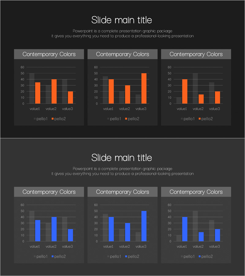
A grouped vertical bar chart PowerPoint slide featuring orange and blue dual-series data visualization. This 2-slide deck provides three independent graph areas per slide, enabling simultaneous comparison of multiple data points across categories. The dark background with high-contrast orange and blue bars ensures excellent data readability and visual impact. Ideal for market analysis presentations, sales performance comparisons, departmental metrics, and quantitative business reports that require clear numerical data representation.
Usage Points
-
Main Usage
Visualizes two-series quantitative data using grouped vertical bars to clearly compare numerical values across categories. The three graph areas per slide allow simultaneous presentation of multiple comparison datasets, making it ideal for showing competitive analysis, period-over-period trends, or departmental performance metrics.
-
How to Use
Apply in market analysis sections to compare sales performance against competitors, display quarterly results, or benchmark departmental achievements. Simply replace the sample values and labels with your actual data to create a professional presentation-ready slide.
-
Recommended For
Marketing managers, sales directors, financial analysts, and executives preparing performance reports. Suitable for business plans, quarterly earnings presentations, investor pitch decks, and strategic planning documents.
-
Slide Structure
Two-slide layout with three independent grouped vertical bar chart areas per slide. Each chart displays two data series (orange and blue bars), three value categories (value1, value2, value3), and legend. Dark background with high-contrast color palette for optimal data visibility.
Related Products
-

Competitor Comparison Analysis Bar Graph – Market Insights
#Market and Competitor Analysis #Graph #Competitor Analysis
-

Startup Company Market Analysis Graph – Competition and Growth
#Market and Competitor Analysis #Diagram #Graph
-

Big Data Analysis Graph - An Effective Market Analysis Tool
#Market and Competitor Analysis #Graph #Competitor Analysis
-

Successful Business Analysis Graph – Market and Competitor Analysis
#Market and Competitor Analysis #Graph #Competitor Analysis
