Sales and Profit Analysis Table Chart
RJ0400069_16
- Last Update 06/06/2025
- File Size 1.5MB
- # of Slides 2
- File Format PPTX
- Slide Ratio 16:9
- Color
Keywords
- #Content-Based Slides
- #Design-Based Slides
- #Financial Plans and Performance
- #Diagram
- #Income Statement
- #Sales and Revenue
- #Table
- #16:9
- #financial data table PowerPoint slide
- #sales profit analysis presentation
- #data comparison table slide
- #financial chart PPT design
- #performance analysis table template
About the Product
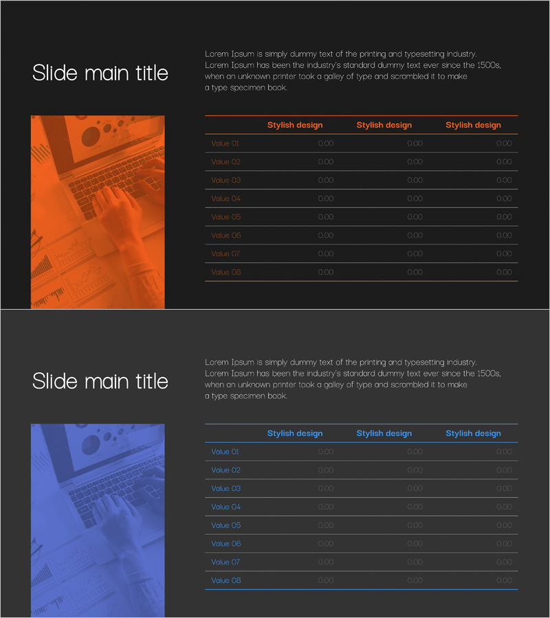
A professional PowerPoint slide designed for systematic comparison and analysis of sales and profit data. This presentation template features two layout variations with dark backgrounds and orange or blue accent colors, each displaying an 8-row by 3-column table structure. The slide combines a left-side image area with a right-side table section, creating a balanced two-column layout that enhances information clarity and visual impact. Ideal for financial reports, performance analysis, and executive presentations. Available in 16:9 PPTX format with fully editable elements for immediate customization.
Usage Points
-
Main Usage
This slide enables clear comparison and visualization of multiple financial metrics and performance indicators in tabular format. Display sales figures, profit margins, costs, and revenue data simultaneously to support data-driven decision-making, with a balanced layout combining imagery and structured data presentation.
-
How to Use
Use in investor presentations, quarterly earnings reports, annual financial reviews, and executive briefings. Replace the left-side image with company logos or relevant photography, and populate table cells with actual financial figures. Customize header colors and text to match corporate branding guidelines.
-
Recommended For
CFOs, financial analysts, business executives, and investor relations teams. Suitable for quarterly performance reviews, annual financial statements, ROI presentations, budget planning meetings, and stakeholder communications requiring data credibility.
-
Slide Structure
Two-slide set with each slide divided into left image area (approximately 30%) and right table area (approximately 70%). Tables contain one header row with three columns and eight data rows. Orange or blue accent colors highlight headers to establish clear visual hierarchy and improve data readability.
Related Products
-

Sales and Profit Table Diagram
#Financial Plans and Performance #Diagram #Income Statement
-

Internet Shopping Sales and Profit Calculation Chart – Your Business Success Guide
#Financial Plans and Performance #Diagram #Graph
-

Sales and Profit Calculation Table – Key to Profit Management
#Financial Plans and Performance #Diagram #Income Statement
-

Sales and Profit Table – Clear Visualization of Financial Planning
#Financial Plans and Performance #Diagram #Other
