Market Share Pie Chart – Effective Market Analysis
RJ0400061_26
- Last Update 06/03/2025
- File Size 0.2MB
- # of Slides 2
- File Format PPTX
- Slide Ratio 16:9
- Color
Keywords
- #Content-Based Slides
- #Design-Based Slides
- #Product/Service Introduction
- #Market and Competitor Analysis
- #Diagram
- #Graph
- #Development Status
- #Market Share
- #Circles
- #Doughnut Chart
- #16:9
- #donut chart PowerPoint slide
- #pie chart template
- #ratio data visualization
- #market share chart
- #donut graph presentation
About the Product
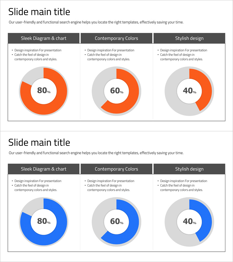
A professional donut chart PowerPoint slide template designed to visualize market share, sales distribution, customer composition, and budget allocation with clarity and impact. The two-color design features orange and gray tones on the first slide, and blue and gray on the second, allowing you to select the color scheme that best matches your presentation tone. Each slide displays three donut charts representing different data ratios (80%, 60%, 40%), making it easy to adapt to various business scenarios. The center of each donut includes a data label area for displaying percentages or absolute values. All text, numbers, and colors are fully editable in PowerPoint, enabling quick customization for your specific content without design expertise.
Usage Points
-
Main Usage
Effectively communicate proportional data such as market share, sales breakdown, customer demographics, and budget distribution. The donut design with center labels emphasizes key metrics, while the two-tone color scheme distinguishes primary and secondary data segments, enhancing audience comprehension and engagement.
-
How to Use
Incorporate into executive reports, marketing presentations, and business analysis decks during the data visualization section. Use the orange version for warm-toned presentations and the blue version for corporate or financial contexts. Simply double-click on the percentage labels and chart segments to input your own data and customize colors as needed.
-
Recommended For
Finance managers, marketing professionals, business consultants, and executives presenting quarterly reports or strategic analyses. Also suitable for students and researchers presenting statistical findings. Ideal for anyone needing to communicate data-driven insights with visual clarity.
-
Slide Structure
Two-slide set, each containing three donut charts arranged horizontally. Slide 1 features orange accent segments with gray backgrounds representing 80%, 60%, and 40% ratios. Slide 2 uses blue accent segments with the same ratio structure. Each donut has an editable center label area for displaying percentages, values, or category names. All chart elements are grouped for easy resizing and repositioning.
Related Products
-

Development Status Analysis Connection Diagram – Effective Information Delivery
#Product/Service Introduction #Market and Competitor Analysis #Diagram
-

Aviation Service Development Schedule Donut Circle Graph
#Product/Service Introduction #Market and Competitor Analysis #Diagram
-

Big Data Development Status Analysis Graph – Conveying Market Share
#Product/Service Introduction #Market and Competitor Analysis #Diagram
-

Donut Chart Slide for Market Share Status – Asset Management Development
#Product/Service Introduction #Market and Competitor Analysis #Diagram
