People Silhouette and Comparison Graph – Data Visualization for Customer Analysis
RJ0500024_9
- Last Update 06/13/2025
- File Size 1.8MB
- # of Slides 2
- File Format PPTX
- Slide Ratio 16:9
- Color
Keywords
- #Content-Based Slides
- #Design-Based Slides
- #Market and Competitor Analysis
- #Graph
- #Other
- #Customer Analysis
- #Horizontal Bar
- #Segmented Horizontal Bar
- #Silhouette
- #16:9
- #people silhouette chart
- #horizontal bar chart PowerPoint
- #customer analysis slide
- #data visualization template
- #comparison graph presentation
About the Product
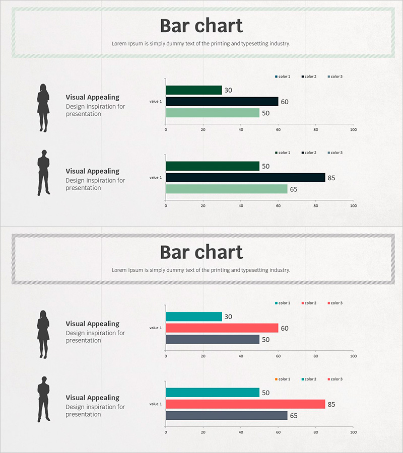
A professional PowerPoint slide combining people silhouettes with horizontal bar charts for customer analysis and market comparison. The 2-slide set features male and female silhouettes on the left side with corresponding 3-series horizontal bar charts on the right, enabling clear data visualization across customer segments. Color-coded bars in dark green, black, and light green represent three data series, with values displayed on a 0–100 scale. Ideal for presentations, reports, and business proposals requiring customer profiling, performance benchmarking, and market analysis sections. Fully editable in 16:9 widescreen format.
Usage Points
-
Main Usage
Visualize customer segment data and market analysis alongside people silhouettes to enhance audience comprehension. Display customer characteristics, preferences, and purchasing patterns by demographic (male/female) using numerical data in an intuitive format. Effective for executive briefings, marketing strategy presentations, and customer analysis reports.
-
How to Use
Double-click the horizontal bar chart values to input your actual data, and update the legend labels (color 1, color 2, color 3) to match your analysis categories. Add customer segment names, age ranges, or job titles in the text area next to the silhouettes to provide context and ensure immediate audience understanding.
-
Recommended For
Marketing, sales, HR, and business planning professionals presenting customer analysis, performance evaluations, and comparative metrics. Particularly suited for B2B sales presentations, customer segmentation strategies, organizational performance analysis, and market research reports seeking to enhance data credibility.
-
Slide Structure
2-slide layout with each slide divided into two sections: left 50% contains a people silhouette (male or female) with text input area; right 50% displays a 3-series horizontal bar chart (value 1, value 2, value 3) on a 0–100 scale. Data labels appear at the end of each bar for clarity.
Related Products
-

Office Worker Briefcase Silhouette Diagram – Intuitive Customer Analysis
#Product/Service Introduction #Market and Competitor Analysis #Diagram
-

Quality PowerPoint Wide Template for Customer and Market Analysis
#Market and Competitor Analysis #Other #Customer Analysis
-

Businessperson Work Ability Analysis Graph – Successful Ability Assessment
#Product/Service Introduction #Market and Competitor Analysis #Diagram
-

Human Details Infographic Chart – Customer Analysis and Market Overview
#Market and Competitor Analysis #Graph #Other
