Horizontal Bar Charts for Customer Analysis – Summer Vacation Template
RJ0500046_19
- Last Update 06/20/2025
- File Size 0.3MB
- # of Slides 2
- File Format PPTX
- Slide Ratio 16:9
- Color
Keywords
- #Content-Based Slides
- #Design-Based Slides
- #Market and Competitor Analysis
- #Graph
- #Other
- #Customer Analysis
- #Market Share
- #Horizontal Bar
- #Segmented Horizontal Bar
- #16:9
- #horizontal bar chart PowerPoint
- #bar chart slide template
- #data comparison presentation
- #customer analysis PPT
- #infographic PowerPoint slide
About the Product
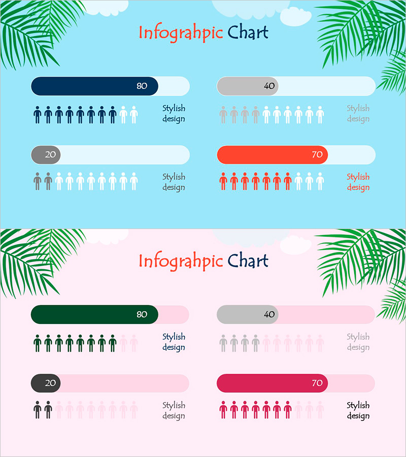
A horizontal bar chart PowerPoint slide optimized for customer analysis and data comparison. The design features a bright sky-blue background with navy, gray, and red bar charts arranged in an infographic format using human icons to intuitively represent numerical data. The 2-slide set provides consistent layout for maintaining design coherence throughout your presentation. Created in fresh summer vacation tones, it's ideal for educational, marketing, and sales presentations requiring clear data visualization.
Usage Points
-
Main Usage
This horizontal bar chart specializes in comparing and ranking numerical data across items. Perfect for customer analysis, sales comparison, satisfaction surveys, and market share representation with 4 data points. The integration of human icons makes it particularly effective for demographic and population-based data visualization.
-
How to Use
Input your actual data into the bar chart areas and the lengths automatically adjust to reflect your values. Edit item labels and numbers to customize the slide for your specific dataset. The bright background and colorful bar design enhance the visual impact of your presentation without requiring advanced design skills.
-
Recommended For
Ideal for marketing team customer analysis reports, sales team performance presentations, educational institution student satisfaction surveys, and corporate quarterly performance analysis. Recommended for data-driven decision-making meetings and seminars where audience comprehension of comparative metrics is essential.
-
Slide Structure
The 2-slide set features identical layouts for consistency. Each slide contains 4 horizontal bar charts distinguished by navy (80), gray (40), gray (20), and red (70) color values. Human icons are positioned below each bar to enhance the infographic effect. Formatted in 16:9 widescreen ratio for optimal compatibility with modern presentation environments.
Related Products
-

Financial Plans and Performance Presentation Template – Professional and Reliable Design
#Market and Competitor Analysis #Financial Plans and Performance #Graph
-

Customer Share Analysis Chart – Insights for Successful Business
#Market and Competitor Analysis #Graph #Other
-

Drug Addiction Gender Ratio Analysis Graph - Customer Analysis
#Market and Competitor Analysis #Graph #Other
-

Market Share Donut Pie Chart & Silhouette – Unique Design and Information Delivery
#Market and Competitor Analysis #Graph #Other
