Fintech Market Analysis Bar Graph – Clear Data Visualization
RJ0400058_24
- Last Update 06/02/2025
- File Size 0.2MB
- # of Slides 2
- File Format PPTX
- Slide Ratio 16:9
- Color
Keywords
- #Content-Based Slides
- #Design-Based Slides
- #Market and Competitor Analysis
- #Diagram
- #Graph
- #Competitor Analysis
- #Market Analysis
- #Cluster
- #Column
- #Chain Diagram
- #Segmented Column
- #16:9
- #vertical bar chart PowerPoint
- #bar graph slide template
- #data comparison chart
- #market analysis graph
- #year-over-year trend PPT
About the Product
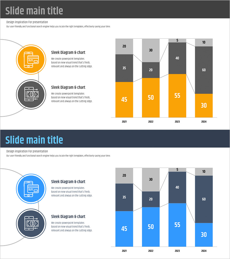
A vertical bar chart PowerPoint slide designed for fintech market analysis and financial reporting. This presentation template visualizes 4 years of data (2021-2024) across 2 data series using orange and gray color schemes. Each year's values are clearly labeled, making it ideal for communicating quantitative information such as market size changes, revenue trends, and growth rate comparisons in business reports and investor presentations. The 2-slide set offers multiple color combinations and is fully editable in PPTX format for immediate customization.
Usage Points
-
Main Usage
Ideal for comparing numerical data across years, quarters, or categories using 2 or more data series. The bar height intuitively represents data magnitude, while color differentiation clearly distinguishes between series. Perfect for communicating market size evolution, revenue trends, growth rate comparisons, and other quantitative insights in executive presentations.
-
How to Use
Use in business reports, market analysis presentations, investor pitch decks, and marketing strategy documents for year-over-year or period-over-period performance comparison sections. Double-click existing values to edit directly, or use the chart data editing feature to adjust the number of series and categories. Colors can be modified through the theme color palette.
-
Recommended For
Recommended for finance and executive-level reports, fintech and financial services market analysis, startup investor presentations, consulting firm strategy proposals, and marketing team performance reviews. Particularly suited for roles requiring quantitative data visualization (finance managers, analysts, planners, executives).
-
Slide Structure
2-slide set featuring orange and blue color scheme variations. Each slide contains 4 years (2021-2024) × 2 data series = 8 bars with numeric labels displayed above each bar. Left side includes 2 circular icons with descriptive text area, allowing space for chart title and interpretation alongside the visualization.
Related Products
-

Service Analysis Radial Graph – Market and Competitor Analysis
#Market and Competitor Analysis #Diagram #Graph
-

Market Analysis Segmented Bar Graph & Table Chart – Visualization of Competitive Analysis
#Market and Competitor Analysis #Diagram #Graph
-

Analysis Vertical Bar Graph – Market Competitiveness Visualization
#Market and Competitor Analysis #Graph #Competitor Analysis
-

Curved Area Graph for Market Analysis Visualization – Insights Provided
#Market and Competitor Analysis #Diagram #Graph
