Doughnut Chart for Online Shopping Mall Market Analysis
RJ0400057_6
- Last Update 06/02/2025
- File Size 0.2MB
- # of Slides 2
- File Format PPTX
- Slide Ratio 16:9
- Color
Keywords
- #Content-Based Slides
- #Design-Based Slides
- #Product/Service Introduction
- #Market and Competitor Analysis
- #Graph
- #Development Status
- #Market Share
- #Circles
- #Doughnut Chart
- #16:9
- #doughnut chart PowerPoint
- #pie chart slide template
- #market analysis graph
- #percentage data visualization
- #4-item chart download
About the Product
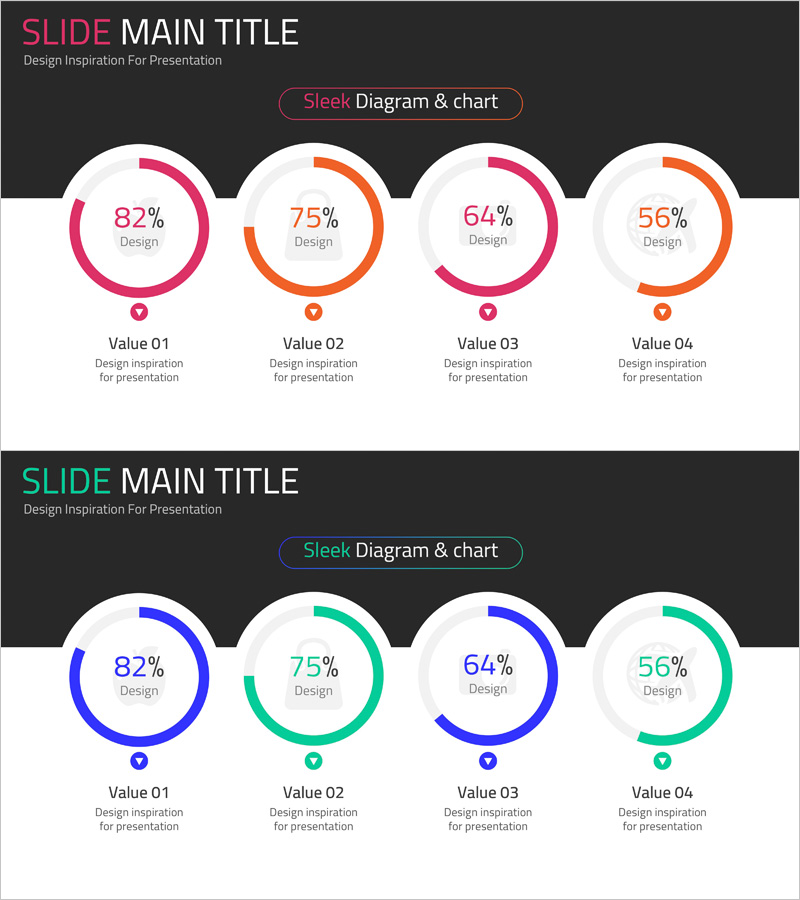
A 4-item doughnut chart PowerPoint slide designed for online shopping mall market analysis and data visualization. Features pink and orange dual-tone color scheme with clear percentage displays and comparison labels beneath each chart. The 2-slide set includes an alternative blue and teal color variation for flexible presentation styling. Optimized for 16:9 widescreen in PPTX format with fully editable elements. Perfect for visualizing market share, customer demographics, sales channel distribution, and product category breakdown. Each chart includes dedicated label and description areas for seamless integration into business reports, pitch decks, and strategic presentations.
Usage Points
-
Main Usage
Visualize four-category ratio data such as market share distribution, customer segment breakdown, sales channel percentages, and product category revenue proportions. The hollow center of each doughnut allows for emphasis of key metrics or category titles, making it ideal for executive summaries and analytical presentations.
-
How to Use
Double-click each doughnut chart to edit the percentage values and colors. Update the label text below each chart with your category names and descriptions. Adjust chart sizes and spacing as needed. Select between the two color schemes (pink-orange or blue-teal) to match your presentation theme.
-
Recommended For
Marketing teams presenting market analysis reports, executive quarterly performance reviews, new business strategy proposals, e-commerce platform analytics dashboards, management consulting industry analysis, retail sector competitive positioning, and data-driven business presentations.
-
Slide Structure
2-slide set with 4 doughnut charts arranged horizontally on each slide. Each chart displays a percentage value in the center, with category label and description text positioned below. Slide 1 features pink and orange tones; Slide 2 provides blue and teal alternatives for design flexibility.
Related Products
-

Sales Status Analysis Graph – Simple and Stylish Design
#Product/Service Introduction #Market and Competitor Analysis #Graph
-

City Theme Market Share Graph – Business Data Visualization
#Product/Service Introduction #Market and Competitor Analysis #Graph
-

Graph of Analysis of Transportation Development Status
#Product/Service Introduction #Market and Competitor Analysis #Graph
-

Development Status Analysis Donut Chart – Market Share Visualization
#Product/Service Introduction #Market and Competitor Analysis #Graph
