Sales and Profit Comparison Graph & Table – Clear Financial Analysis
RJ0400053_27
- Last Update 06/01/2025
- File Size 0.1MB
- # of Slides 2
- File Format PPTX
- Slide Ratio 16:9
- Color
Keywords
- #Content-Based Slides
- #Design-Based Slides
- #Financial Plans and Performance
- #Diagram
- #Graph
- #Other
- #Income Statement
- #Sales and Revenue
- #Table
- #16:9
- #sales profit comparison PowerPoint slide
- #area chart financial analysis
- #dual table presentation slide
- #financial data visualization PPT
- #how to create financial comparison in PowerPoint
About the Product
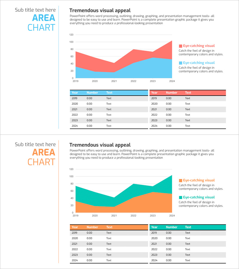
A 2-slide PowerPoint set visualizing sales and profit comparison with dual-layer area chart and data tables. The upper area chart displays 2019–2024 trends in blue and red stacked layers, while the lower dual-table structure presents year-by-year numerical data for precise financial reporting. Fully editable in PowerPoint, designed for investor presentations, financial reports, and executive briefings. 16:9 aspect ratio, PPTX format.
Usage Points
-
Main Usage
Clearly visualize financial performance to communicate sales and profit trends and relationships to executives, investors, and stakeholders. The layered area chart combined with precise numerical tables reinforces data credibility and analytical depth.
-
How to Use
Apply to investor relations (IR) financial sections, quarterly and annual business reports, financial analysis presentations, and shareholder meeting materials. Replace chart colors and table values with your own data for immediate presentation use.
-
Recommended For
CFOs, finance managers, executives, investor relations specialists, financial analysts, and business performance presenters. Ideal for situations requiring persuasive quantitative financial data communication.
-
Slide Structure
Slide 1: Area Chart – 2-layer visualization (blue and red), 6 data points (2019–2024), 2 legend items / Slide 2: Dual-table layout – left table (blue header, 6 rows), right table (red header, 6 rows), each with 3 columns (Year, Number, Text)
Related Products
-

Sales and Profit Analysis Chart – Data Driven Insights
#Market and Competitor Analysis #Financial Plans and Performance #Diagram
-

Orange Green Profit and Loss Chart – Visualizing Revenue and Profit
#Financial Plans and Performance #Diagram #Graph
-

Table and Positioning – Marketing Strategy Analysis Slide
#Marketing Plan and Strategy #Financial Plans and Performance #Diagram
-

Internet Shopping Sales and Profit Calculation Chart – Your Business Success Guide
#Financial Plans and Performance #Diagram #Graph
