Global Target Market Analysis Graph
RJ0400053_20
- Last Update 06/01/2025
- File Size 0.8MB
- # of Slides 2
- File Format PPTX
- Slide Ratio 16:9
- Color
Keywords
- #Content-Based Slides
- #Design-Based Slides
- #Market and Competitor Analysis
- #Diagram
- #Graph
- #Other
- #Market Analysis
- #Target Market
- #Table
- #Column
- #Other
- #Horizontal Table
- #Column Chart
- #Mixed Chart
- #Map
- #16:9
- #world map PowerPoint slide
- #market analysis chart
- #mixed chart template
- #regional data visualization
- #global market presentation
- #geographic market comparison
About the Product
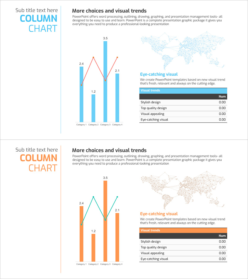
A comprehensive world map-based mixed chart PowerPoint slide designed for global market analysis presentations. This slide combines vertical bar charts and line graphs to simultaneously display regional market size and growth trends across key geographic areas. The design uses contrasting light blue and orange color schemes for data clarity, with a world map background highlighting major market regions. The 2-slide set provides flexibility for various market analysis scenarios and is optimized for business presentation market trend sections. All elements including charts, text, and data points are fully editable, allowing you to input actual data and customize the slides to match your company's branding and presentation style.
Usage Points
-
Main Usage
Designed to visually represent global market analysis and regional business performance. The world map background displays regional market sizes using vertical bar charts while line graphs simultaneously show growth trends, enabling stakeholders to comprehend complex market data at a glance.
-
How to Use
Ideal for investor presentations, executive reports, and marketing strategy meetings when explaining global market conditions. Replace the sample data with your actual figures, adjust colors and legends to match your company branding, and transform the slide into a professional market analysis document.
-
Recommended For
Recommended for executives, marketing managers, business development teams, investor relations professionals, and consultants working with global market data. Particularly effective for international business strategy presentations, market entry planning, and quarterly performance reports.
-
Slide Structure
Slide 1 features a world map background with a mixed chart combining 4 regional vertical bar graphs (blue and orange bars) and a line graph (red line) overlay. Slide 2 provides an alternative color version of the same structure for flexibility across different presentation contexts. All chart elements, text boxes, and legend items are individually editable.
Related Products
-

World Map Data Slide | Regional Statistics Visualization PPT
#Market and Competitor Analysis #Marketing Plan and Strategy #Other
-

Business Plan Presentation Template - World Wide Map
#Market and Competitor Analysis #Financial Plans and Performance #Graph
-

Presentation Slide Visualizing Company Performance with Column Chart
#Company Introduction #Market and Competitor Analysis #Diagram
-

Global Country Analysis Vertical Bar Graph – Market and Competitor Analysis
#Company Introduction #Market and Competitor Analysis #Graph
