Big Data Analysis Line Graph – Visualizing Competitive Advantage
RJ0400053_11
- Last Update 06/01/2025
- File Size 0.1MB
- # of Slides 2
- File Format PPTX
- Slide Ratio 16:9
- Color
Keywords
About the Product
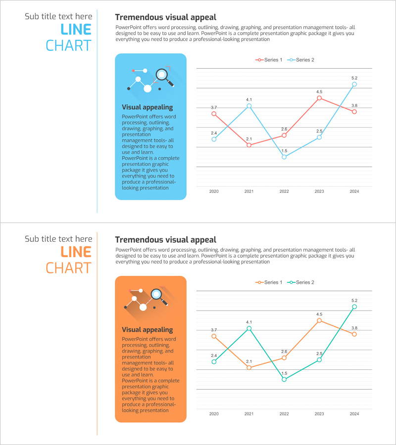
A professional line chart PowerPoint slide comparing two data series across a five-year timeline from 2020 to 2024. This presentation template features dual-axis line graphs with clearly marked data points for each series, enabling side-by-side trend analysis. The slide design includes a text box on the left for key insights and messaging, while the right side displays the line chart with contrasting blue and red color schemes for easy series differentiation. Ideal for business presentations, competitive analysis, market reports, and performance dashboards that require clear visualization of temporal data trends.
Usage Points
-
Main Usage
Visualizes and compares two distinct data series over time, enabling stakeholders to identify trends, patterns, and performance gaps. Commonly used for competitive analysis, revenue tracking, market share evolution, customer satisfaction trends, and KPI monitoring across multiple periods.
-
How to Use
Enter your analysis title and key insights in the left text box. Replace the chart data values with your actual figures using PowerPoint's chart editing tools. Customize series colors, line styles, axis labels, and legend to match your brand or presentation theme. Both slides are fully editable and ready for immediate use.
-
Recommended For
Executive reports, business plans, marketing strategies, investor pitch decks, quarterly performance reviews, and market analysis presentations. Ideal for executives, data analysts, marketers, business strategists, and consultants who need to communicate quantitative trends persuasively.
-
Slide Structure
Two-slide set with distinct color themes: first slide features blue accent color, second slide features orange accent. Each slide combines a left-aligned text box (title and description area) with a right-aligned dual-series line chart (5 data points per series, 2020-2024 X-axis). Optimized for 16:9 widescreen format.
Related Products
-

Competitor Idea Analysis Graph
#Market and Competitor Analysis #Graph #Competitor Analysis
-

Analyzing 2 Comparison Graphs - Slides for Deriving Competitive Advantage
#Market and Competitor Analysis #Graph #Competitor Analysis
-

Purple Orange Curved Line Chart – Visualizing Competitive Edge
#Market and Competitor Analysis #Graph #Competitor Analysis
-

Visualizing Market Analysis with Line Chart – Harmony of Mint and Orange
#Market and Competitor Analysis #Diagram #Graph
