Comparative Analysis Graph by Year – Data Visualization
RJ0400052_26
- Last Update 05/31/2025
- File Size 6.7MB
- # of Slides 2
- File Format PPTX
- Slide Ratio 16:9
- Color
Keywords
- #Content-Based Slides
- #Design-Based Slides
- #Product/Service Introduction
- #Market and Competitor Analysis
- #Graph
- #Development Status
- #Competitor Analysis
- #Circles
- #Line
- #Doughnut Chart
- #Line Chart
- #16:9
- #line chart PowerPoint
- #dual-series trend comparison slide
- #data visualization template
- #annual performance graph
- #year-over-year analysis PPT
- #business analytics slide
About the Product
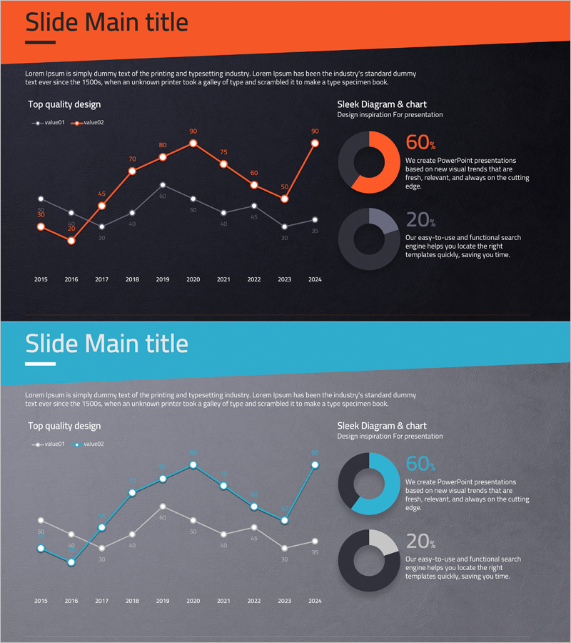
A dual-series line chart PowerPoint slide comparing year-over-year data changes from 2015 to 2024. The design uses contrasting orange and gray color schemes to clearly distinguish two key metrics, with precise numerical labels at each data point for accurate value comparison. The right side features two donut charts displaying percentage breakdowns (60% and 20%), enabling multi-dimensional data analysis. This presentation slide is optimized for market analysis reports, product performance presentations, sales trend analysis, and quantitative data-driven business communications.
Usage Points
-
Main Usage
Visualizes and compares two key performance indicators over time, enabling stakeholders to identify trends, patterns, and correlations. Ideal for presenting sales growth, customer acquisition, market share evolution, or operational metrics across multiple years.
-
How to Use
Integrate into quarterly business reviews, annual reports, investor presentations, and strategic planning meetings. Simply replace sample data with your actual figures; the chart automatically updates for immediate presentation deployment.
-
Recommended For
Marketing managers, financial analysts, C-suite executives, management consultants, and sales directors who need to communicate quantitative insights. Particularly effective for board meetings, investor relations, and cross-functional strategy sessions requiring multi-metric comparison.
-
Slide Structure
Two-slide set. Slide 1: Orange background with dual-series line chart (10 data points spanning 2015–2024) and two donut charts on the right (60% and 20% representations). Slide 2: Identical layout with cyan/blue background variant. 16:9 widescreen format, fully editable PPTX.
Related Products
-

Competitor Progress Comparison Analysis Graph – Essential Tool for Market Analysis
#Market and Competitor Analysis #Graph #Competitor Analysis
-

Blue Green Progress Visualization – Graph for Achievement Rate
#Product/Service Introduction #Business Strategy #Market and Competitor Analysis
-

Market Trend Analysis Charts & Diagrams – Essential Tool for Competitor Analysis
#Market and Competitor Analysis #Graph #Competitor Analysis
-

Writing Instrument Icon Pie Chart – Company Introduction and Product Achievements
#Company Introduction #Product/Service Introduction #Graph
