Mobile Application Analysis Graph – Data Visualization for Market Understanding
RJ0400050_16
- Last Update 05/31/2025
- File Size 0.5MB
- # of Slides 2
- File Format PPTX
- Slide Ratio 16:9
- Color
Keywords
About the Product
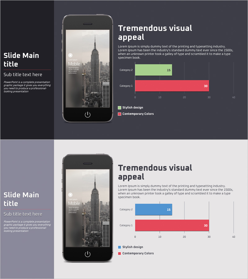
A horizontal bar chart PowerPoint slide designed for mobile application market analysis and data comparison. This presentation template features two data series in green and red colors, enabling intuitive visualization of category-by-category metrics. Optimized for 16:9 widescreen format with 2 slides, it's ready for immediate use in market analysis and competitive benchmarking presentations. Clear axis labels and legend placement facilitate data interpretation, while color customization allows adaptation to various presentation topics and corporate branding requirements.
Usage Points
-
Main Usage
Visualize mobile application market trends, category-by-category performance metrics, and competitive analysis through horizontal bar chart format to enhance audience comprehension. The two-series comparison structure is optimized for presentations requiring side-by-side data contrast and performance benchmarking.
-
How to Use
Replace the category labels and numerical values with your own data. Modify the legend text (Stylish design / Contemporary Colors) to match your presentation topic and adjust colors to align with corporate branding guidelines. Add title and descriptive text to complete the slide customization.
-
Recommended For
Marketing professionals, business analysts, product managers, and investment presentation speakers will find this template ideal for market overview presentations, performance comparisons, and competitive analysis. Particularly suited for mobile app, SaaS, and digital service industry presentations.
-
Slide Structure
2-slide layout with one horizontal bar chart per slide. Each chart displays 2 data series (green and red bars) across 2 category items, with a numerical axis ranging from 0 to 40. Title and chart areas are clearly separated, enabling straightforward text insertion and customization.
Related Products
-

Cell Phone Mockup Bar Graph – Market Analysis and Technology Status
#Business Introduction #Market and Competitor Analysis #Graph
-

Pencil Bar Chart for Market Analysis – Visual Competitiveness
#Market and Competitor Analysis #Graph #Other
-

Customer and Market Analysis Slide – Yellow and Bluegreen Emotion
#Market and Competitor Analysis #Graph #Other
-

Comparison Graph of Major Shopping Areas – Market Trends Analysis
#Business Introduction #Market and Competitor Analysis #Graph
