Area Graph of Comparative Analysis by Year
RJ0400049_16
- Last Update 05/30/2025
- File Size 0.2MB
- # of Slides 2
- File Format PPTX
- Slide Ratio 16:9
- Color
Keywords
About the Product
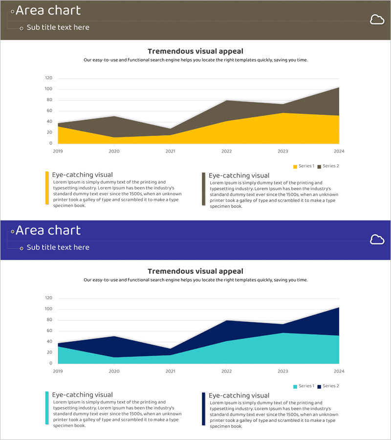
A PowerPoint slide featuring a stacked area chart comparing two data series from 2019 to 2024. Two color schemes are included: brown and yellow combination, and navy and cyan combination. Each slide contains a title and subtitle section, plus legend and descriptive text boxes for detailed insights. Ideal for business presentations on market analysis, competitive benchmarking, and financial trends. The 16:9 PPTX format allows immediate editing and customization of data values.
Usage Points
-
Main Usage
Visualizes cumulative trends of two data series over time or across periods. Effectively highlights market size evolution, revenue composition changes, customer segment shifts, and relative proportional changes across comparable timeframes.
-
How to Use
Enter your analysis topic in the title and subtitle fields at the top. Update the legend and descriptive text to match your data. Modify chart data using PowerPoint's built-in chart editor—the graph automatically updates when you input new values.
-
Recommended For
Suitable for marketing plans, business reports, investor presentations, and market analysis briefings. Particularly valuable for executive, investor, and partner presentations where data-driven decision-making is essential.
-
Slide Structure
Each slide consists of a header area with title and subtitle, a central chart area displaying a two-series stacked area graph, and a footer section with legend and explanatory text boxes. Two color combinations (brown-yellow and navy-cyan) adapt to various presentation tones.
Related Products
-

Area Graph for Business Area Analysis
#Market and Competitor Analysis #Graph #Other
-

Goal Achievement Analysis Area Graph – Data-driven Competitive Edge
#Market and Competitor Analysis #Graph #Other
-

Comparison Bar Chart for Market Competition Analysis – Competitive Advantage
#Market and Competitor Analysis #Graph #Other
-

Zombie Walking Dead Slide – Optimized for Competitor Analysis with Doughnut Chart
#Market and Competitor Analysis #Graph #Other
