Internet of Things Usage Share Analysis Circle Graph
RJ0400049_12
- Last Update 05/30/2025
- File Size 0.2MB
- # of Slides 2
- File Format PPTX
- Slide Ratio 16:9
- Color
Keywords
- #Content-Based Slides
- #Design-Based Slides
- #Product/Service Introduction
- #Market and Competitor Analysis
- #Graph
- #Development Status
- #Market Share
- #Circles
- #Doughnut Chart
- #16:9
- #doughnut chart PowerPoint slide
- #donut chart template
- #pie chart ratio analysis
- #data visualization PowerPoint
- #IoT usage share chart
About the Product
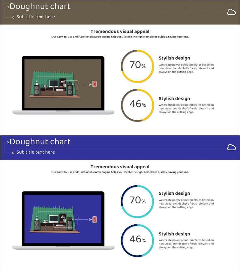
A doughnut chart PowerPoint slide template for visualizing Internet of Things (IoT) usage share and adoption rates. The slide features two donut charts displaying 70% and 46% data points in yellow and gray, with a laptop mockup image on the left to emphasize technology context. Designed in 16:9 widescreen format with 2 slides, this presentation template is ready to use for market analysis, technology adoption rates, user satisfaction metrics, and comparative data visualization.
Usage Points
-
Main Usage
Ideal for comparing two key data ratios such as IoT adoption rates, technology penetration, or market share at a glance. The doughnut chart's center space clearly displays percentage values, while the left-side mockup image reinforces technology context and relevance.
-
How to Use
Use this slide in technology presentations, market analysis reports, and business status updates to explain user adoption rates or technology implementation progress. Easily customize the donut chart colors and percentages to match your specific data and presentation needs.
-
Recommended For
Technology executives, marketing managers, market analysts, product strategists, and investment pitch presenters who need to communicate technology adoption rates and user satisfaction metrics persuasively.
-
Slide Structure
Two-slide set with two doughnut charts per slide. Yellow and gray donut charts represent 70% and 46% data points respectively. Layout includes a laptop mockup image on the left, with chart legend and descriptive text positioned on the right side.
Related Products
-

Map Donut Graph for Visualizing Market Share – Symbol of Practicality and Change
#Product/Service Introduction #Market and Competitor Analysis #Graph
-

Graph of Analysis of Transportation Development Status
#Product/Service Introduction #Market and Competitor Analysis #Graph
-

City Theme Market Share Graph – Business Data Visualization
#Product/Service Introduction #Market and Competitor Analysis #Graph
-

Analysis of Transportation Usage Status – Pie Chart
#Product/Service Introduction #Market and Competitor Analysis #Graph
