Year-over-year Sales and Profit Comparison Chart
RJ0400048_9
- Last Update 05/30/2025
- File Size 0.3MB
- # of Slides 2
- File Format PPTX
- Slide Ratio 16:9
- Color
Keywords
- #Content-Based Slides
- #Design-Based Slides
- #Product/Service Introduction
- #Financial Plans and Performance
- #Diagram
- #Graph
- #Development Status
- #Sales and Revenue
- #Table
- #Horizontal Bar
- #Segmented Horizontal Bar
- #16:9
- #year-over-year sales chart
- #horizontal bar chart PowerPoint
- #sales comparison slide
- #financial performance template
- #annual revenue comparison PowerPoint
About the Product
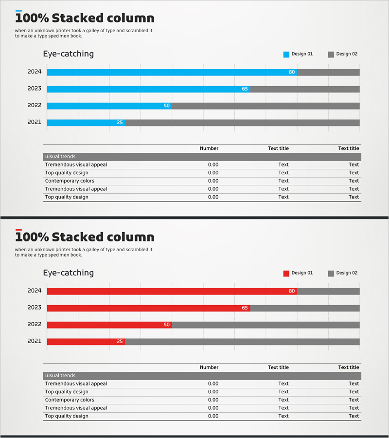
A horizontal bar chart PowerPoint slide that visually compares annual sales and profit performance across four years (2021–2024). The data is represented using two color series—blue for Design 01 and gray for Design 02—making it easy to identify performance trends at a glance. Each year's values (25, 40, 65, 80) are clearly labeled on the bars for precise comparison. This slide is ready to use in financial reports, business performance presentations, investor pitch decks, and quarterly earnings calls. The 16:9 widescreen format with 2-slide layout allows seamless integration with supporting slides, and the PPTX format enables full customization of colors, values, and labels.
Usage Points
-
Main Usage
This slide is designed to present quantitative year-over-year sales and profit comparisons, highlighting business growth trends and financial performance metrics. It serves as a key visual tool in financial sections of presentations, enabling executives and investors to quickly assess performance trajectory and identify growth patterns.
-
How to Use
Insert this slide into the financial performance section of annual reports, business plans, or investor presentations. Replace the sample data with your actual sales and profit figures, adjust colors to match your brand guidelines, and add supporting commentary or annotations as needed. The horizontal bar layout makes it ideal for presentations where space is limited or when comparing multiple years simultaneously.
-
Recommended For
CFOs, financial analysts, business development managers, investor relations specialists, and executive presenters. Ideal for quarterly earnings presentations, annual shareholder meetings, bank loan applications, management consulting reports, and investor pitch decks where quantitative financial data must be clearly communicated.
-
Slide Structure
The slide features a 100% stacked horizontal bar chart with 4 data series (2021, 2022, 2023, 2024). Each year is represented by two color-coded segments: blue bars for Design 01 metrics and gray bars for Design 02 metrics. Values (25, 40, 65, 80) are displayed at the end of each bar for precise reading. The chart includes a clear title, legend, and gridlines for easy interpretation.
Related Products
-

Parallelogram Graph & Table – Visualizing Product/Service Introduction and Financial Performance
#Product/Service Introduction #Financial Plans and Performance #Diagram
-

Sales Outlook Analysis Segmented Graph – Visualizing Financial Performance
#Financial Plans and Performance #Diagram #Graph
-

Sales Outlook Analysis Table – Focus on Market and Financial Performance
#Market and Competitor Analysis #Financial Plans and Performance #Diagram
-

Triangle Pattern Column Chart Presentation Template
#Market and Competitor Analysis #Financial Plans and Performance #Diagram
