Visualizing Current Internet Shopping Payment Technologies with Horizontal Bar Graph
RJ0400046_23
- Last Update 05/29/2025
- File Size 0.5MB
- # of Slides 2
- File Format PPTX
- Slide Ratio 16:9
- Color
Keywords
- #Content-Based Slides
- #Design-Based Slides
- #Business Introduction
- #Market and Competitor Analysis
- #Graph
- #Technological Status
- #Market Analysis
- #Horizontal Bar
- #Segmented Horizontal Bar
- #16:9
- #horizontal bar chart PowerPoint
- #bar graph slide template
- #data comparison chart
- #technology analysis PPT
- #market analysis slide
- #how to create bar chart in PowerPoint
About the Product
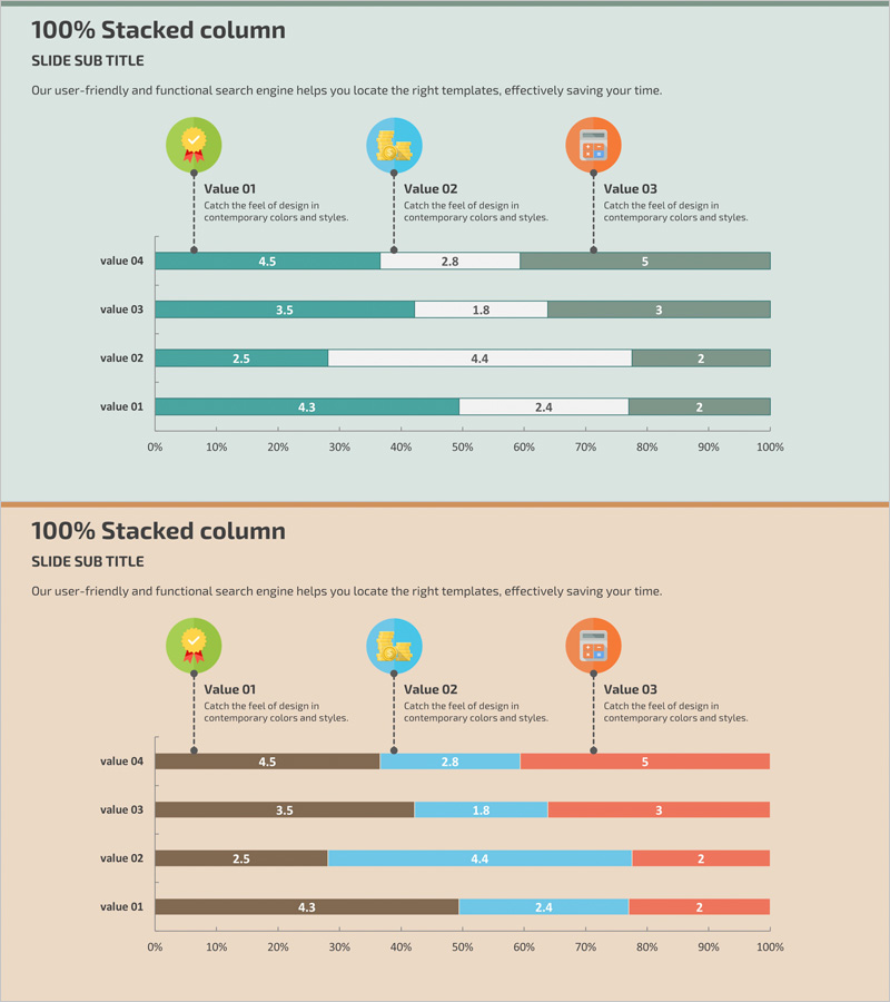
A horizontal bar chart PowerPoint slide for visualizing internet shopping payment technology trends. Designed with teal and orange dual-tone colors, this slide compares four items across three data series displayed horizontally. Three icons (star, animal, device) with descriptive text at the top provide intuitive context for the data. Ideal for technology trend analysis, market comparison, business overview presentations, and quantitative data visualization in professional reports.
Usage Points
-
Main Usage
Compares quantitative data across four items using horizontal bar representation. Displays three data series per item simultaneously, making it easy to identify differences between items and trends across series. Perfect for technology status analysis, market share comparison, and multi-layered performance metrics.
-
How to Use
Three icons at the top symbolize each data series. Enter numerical values into the color-coded bar segments, which automatically adjust in length. The left-to-right visual flow supports natural narrative progression during presentations, allowing you to build your data story effectively.
-
Recommended For
Recommended for technology trend analysis, market research reports, business overview presentations, product comparison materials, and performance analysis documents. Especially effective when presenting three or more comparison subjects simultaneously or emphasizing detailed series data by item.
-
Slide Structure
Three icons with legend (Value 01, 02, 03) positioned at top; four horizontal bar chart rows (value 04, 03, 02, 01) in center; each row contains three color-coded series (teal, white, orange); 0–100% scale axis for easy ratio comparison.
Related Products
-

Content Composition Breakdown by Year with Horizontal Bar Chart
#Business Introduction #Market and Competitor Analysis #Graph
-

Business Sector Analysis Chart – Multifaceted Visualization
#Business Introduction #Market and Competitor Analysis #Diagram
-

4-Step Business Process Graph – Market Analysis and Technology Status
#Business Introduction #Market and Competitor Analysis #Graph
-

Pie Chart & Bar Graph for Market Analysis – Visualizing Data
#Market and Competitor Analysis #Graph #Market Status
