Surgical Drape Theme Radial Graph – Visualizing Technical Status
RJ0400045_23
- Last Update 05/29/2025
- File Size 2.3MB
- # of Slides 2
- File Format PPTX
- Slide Ratio 16:9
- Color
Keywords
- #Content-Based Slides
- #Design-Based Slides
- #Business Introduction
- #Diagram
- #Graph
- #Technological Status
- #Table
- #Standard Table
- #16:9
- #radial graph PowerPoint
- #multi-indicator analysis slide
- #technical status presentation
- #competency assessment chart
- #radar chart PowerPoint template
- #6-axis data visualization
About the Product
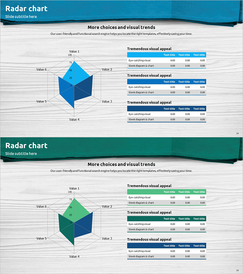
A 6-axis radial graph PowerPoint slide designed to visualize and compare multiple technical indicators, competencies, and performance metrics simultaneously. The teal gradient polygon structure creates an intuitive visual representation of data dimensions, complemented by three data tables on the right side for quantitative details. Ideal for technical presentations, performance reports, and strategic planning documents where capability assessment, achievement analysis, and technology stack comparison are required. Includes 2 slide variations with different color schemes (teal, green, navy), fully editable in PPTX format.
Usage Points
-
Main Usage
Simultaneously compare and analyze 6 key indicators such as technical capabilities, performance metrics, and competency levels. The polygon area provides intuitive visual representation of data magnitude, while the accompanying data tables on the right offer quantitative support for persuasive presentations.
-
How to Use
Apply to technical status presentations, capability assessment meetings, performance analysis reports, and strategic planning documents. Edit axis labels and values to input your organization's, product's, or project's multi-dimensional metrics, then add detailed descriptions in the right-side tables to complete the slide.
-
Recommended For
Technology managers, project managers, executives, consultants, and researchers presenting capability assessments, performance analyses, and technology comparisons. Suitable for IT, manufacturing, R&D, and consulting industries in strategy meetings, reports, and proposals.
-
Slide Structure
One 6-axis radial graph (radar chart) on the left with polygon data area, paired with three data tables on the right. The polygon area features three color variations (teal, green, navy) with Value 1-6 axis labels and 0-100 scale. Right-side tables contain rows for 'eye-catching visual,' 'sleek diagram & chart,' and corresponding data columns.
Related Products
-

Big Data Development Status Analysis Graph – Visualizing Business Strategy
#Product/Service Introduction #Business Introduction #Diagram
-

Doughnut Chart for Financial Performance Visualization – Current Technology Status
#Business Introduction #Financial Plans and Performance #Diagram
-

Goal Setting & Radial Graph – Intuitive Data Visualization
#Business Introduction #Market and Competitor Analysis #Diagram
-

Big Data Development Status Radial Graph – Captivating Visual Appeal
#Product/Service Introduction #Business Introduction #Diagram
