Medical Analysis Donut Circle Graph – The Completion of Data Visualization
RJ0400045_16
- Last Update 05/29/2025
- File Size 3.4MB
- # of Slides 2
- File Format PPTX
- Slide Ratio 16:9
- Color
Keywords
About the Product
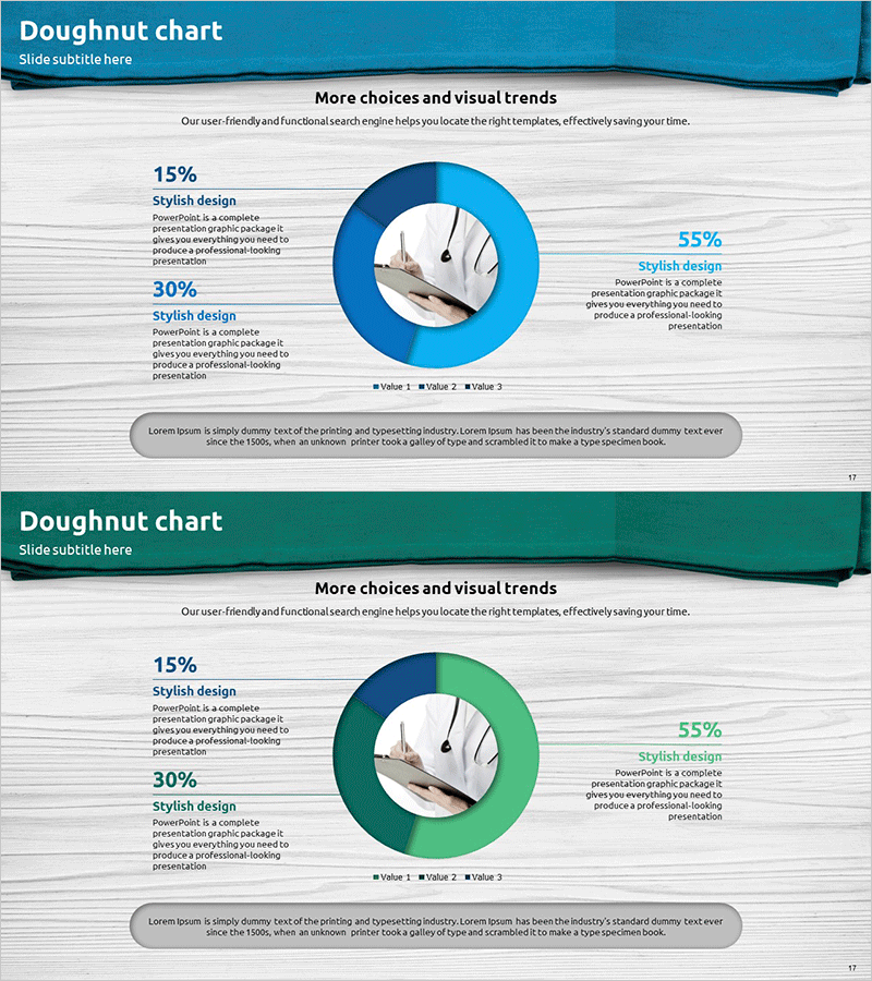
A professional donut chart PowerPoint slide set featuring 2 slides optimized for medical and analytical presentations. The design combines a central image area with left-right text layout to clearly express data ratios, utilizing a three-color palette of navy blue, light blue, and green segments. Each donut segment displays percentage values and descriptive text, enhancing information clarity and visual impact. The 16:9 widescreen format ensures seamless compatibility with modern presentation environments. Delivered in fully editable PPTX format, ready for immediate use in corporate reports, medical seminars, business analysis presentations, and healthcare industry communications.
Usage Points
-
Main Usage
Intuitively visualize data composition ratios and part-to-whole relationships using a professional donut chart design. Effectively communicate medical statistics, market share, budget allocation, customer demographics, and other ratio-based information. The central circular area allows emphasis of key icons, photos, or logos relevant to your presentation context.
-
How to Use
Enter category names and descriptions in the left and right text areas, then adjust the donut chart percentages to match your data. Insert medical equipment photos, product images, or logos in the center circular area to customize for your specific presentation needs. Colors can be easily modified to match corporate brand guidelines.
-
Recommended For
Ideal for pharmaceutical and medical device companies presenting clinical data, hospitals and clinics analyzing patient demographics, healthcare companies reporting market share, health tech startups explaining business metrics, medical consulting firms presenting analytical findings, and healthcare organizations communicating statistical insights.
-
Slide Structure
2-slide set. Each slide features a navy blue header section with title area, central donut chart with 3 segments in navy blue, light blue, and green, left text box for 15% and 30% data points, right text box for 55% data point, center circular image placeholder, and bottom descriptive text area for additional context.
Related Products
-

Pie Chart for Data Comparison – Quality and Color
#Business Introduction #Market and Competitor Analysis #Graph
-

Technology Achievement Donut Chart
#Product/Service Introduction #Business Introduction #Graph
-

Donut Pie Chart for Medical Technology – Market Share Analysis
#Business Introduction #Market and Competitor Analysis #Graph
-

Solar System Pie Graph – Stylish Presentation Design
#Business Introduction #Market and Competitor Analysis #Graph
