Pie Chart for Data Comparison – Quality and Color
RJ0200052_17
- Last Update 04/13/2025
- File Size 0.5MB
- # of Slides 2
- File Format PPTX
- Slide Ratio 16:9
- Color
Keywords
About the Product
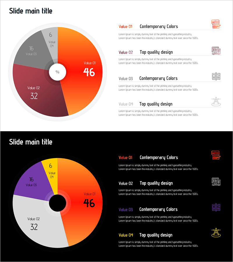
A donut chart PowerPoint slide optimized for data comparison and ratio visualization. This presentation template features a 4-segment donut chart in orange, gray, and wine red colors, with a prominent center circle for highlighting key metrics. The slide deck includes 2 layouts: a light background version and a dark background version for flexible presentation contexts. Each segment is labeled with values and descriptive text areas on the right side, making it ideal for marketing performance reports, market share analysis, customer satisfaction surveys, budget allocation, and sales channel distribution presentations.
Usage Points
-
Main Usage
The donut chart enables viewers to instantly grasp the proportion and composition of each segment relative to the whole. The center circle emphasizes key figures or titles, while color-coded segments clearly distinguish data categories and improve visual hierarchy.
-
How to Use
Apply this slide to marketing performance analysis, market share comparisons, customer satisfaction surveys, budget distribution planning, and sales channel breakdown presentations. Add detailed explanations and insights in the right-side text area to enhance audience comprehension and engagement.
-
Recommended For
Ideal for marketing teams presenting quarterly performance reports, executive briefings on business status, investor presentations on market analysis, sales teams explaining customer data, and planning teams conducting strategy sessions.
-
Slide Structure
2-slide layout: light background version (top) and dark background version (bottom). Each slide features a donut chart on the left (4 segments with emphasized center circle) and a 2-column text area on the right with labels, values, and descriptions. 16:9 widescreen format, fully editable PPTX with all elements customizable.
Related Products
-

Doughnut Chart Visualizing Market Share by Exercise
#Business Introduction #Market and Competitor Analysis #Graph
-

Idea Development Status Graph – Stylish Donut Chart for Market Analysis
#Business Introduction #Market and Competitor Analysis #Graph
-

Visualizing Market Share with Donut Chart – Effective Business Analysis
#Business Introduction #Market and Competitor Analysis #Graph
-

Donut Graph by Caries Erosion Status – Essential for Market Analysis
#Business Introduction #Market and Competitor Analysis #Graph
