Line Chart for Visualizing Data Changes – Effective Information Delivery
RJ0400044_9
- Last Update 05/29/2025
- File Size 0.5MB
- # of Slides 2
- File Format PPTX
- Slide Ratio 16:9
- Color
Keywords
About the Product
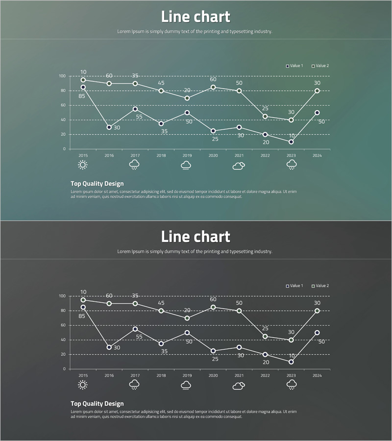
A PowerPoint slide template featuring a line chart that visualizes two-series time-series data spanning from 2015 to 2024. Each data point is clearly labeled with numerical values, enabling precise information delivery and trend analysis. The slide uses a gray-toned background with white gridlines and circular node markers, making it ideal for business reports, performance analysis, and market trend presentations. This PPTX template includes 2 slides in 16:9 widescreen format and is fully editable for immediate use in your presentations.
Usage Points
-
Main Usage
Effectively communicate data changes over time and compare multiple data series through visual representation. Commonly used for executive reporting, quarterly performance reviews, market trend analysis, financial performance tracking, and data-driven decision-making presentations.
-
How to Use
Replace the sample data points and values with your actual dataset. Simply update the numerical values for each year, and the line connections will adjust automatically. Customize the legend labels and axis titles to match your presentation context and data categories.
-
Recommended For
Executives, financial analysts, marketing professionals, project managers, and consultants who need to present quantitative data and support decision-making. Particularly useful for quarterly business reviews, annual performance summaries, market research presentations, and financial forecasting.
-
Slide Structure
Each slide contains a title section, a dual-series line chart with Y-axis scale (0-100) and X-axis years (2015-2024), a legend identifying Value 1 and Value 2, numerical data labels at each point, and a description text area at the bottom for adding insights or conclusions.
Related Products
-

Competitor Analysis Graph – Securing Market Advantage
#Market and Competitor Analysis #Graph #Market Analysis
-

Comparative Chart Analysis – Optimized for Market and Competitive Analysis
#Market and Competitor Analysis #Graph #Market Analysis
-

The Jumping Boys and Bell Charts - Data Visualization for Market Analysis
#Market and Competitor Analysis #Graph #Market Analysis
-

Customer Analytics Bell Diagram – Competitive Advantage Analysis
#Market and Competitor Analysis #Graph #Market Analysis
