Vertical Bar Chart for Data Analysis Visualization – Functionality and Reliability
RJ0400043_16
- Last Update 05/28/2025
- File Size 1.5MB
- # of Slides 2
- File Format PPTX
- Slide Ratio 16:9
- Color
Keywords
About the Product
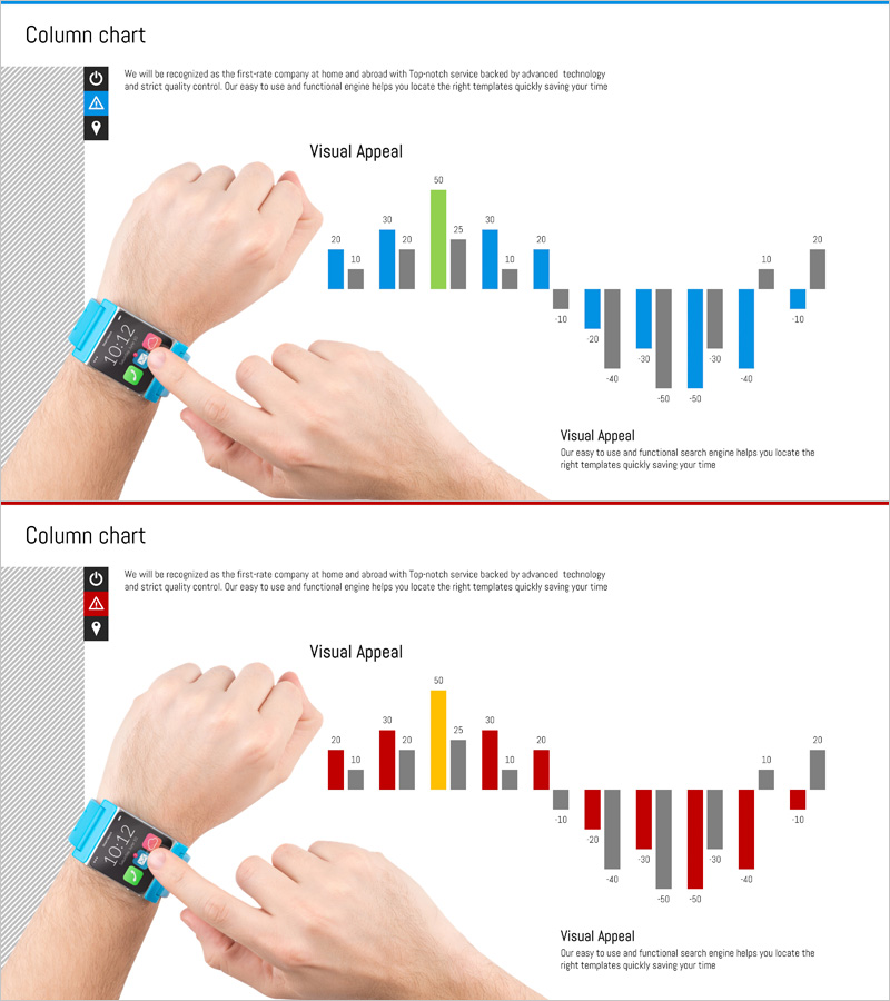
A professional vertical bar chart PowerPoint slide optimized for business data analysis and performance reporting. This 2-slide template features three data series in blue, gray, and green colors, enabling simultaneous comparison of multiple items with support for negative values to visualize trends and changes. Formatted in 16:9 widescreen and fully editable in PPTX format, it's ideal for sales reports, departmental performance reviews, quarterly metrics, and comprehensive business presentations requiring quantitative data visualization.
Usage Points
-
Main Usage
Compare numerical data across multiple items using bar height representation, with support for three or more data series displayed simultaneously. Negative value capability enables clear distinction between increases and decreases, making it highly effective for performance analysis, results comparison, and KPI evaluation.
-
How to Use
Apply this template to sales performance presentations, quarterly earnings reports, departmental KPI comparisons, market analysis materials, and financial status briefings. The bar heights and color coding enable immediate numerical differentiation, significantly enhancing audience comprehension and data retention.
-
Recommended For
Sales managers, marketing analysts, finance professionals, executive reporting teams, quarterly and annual performance presenters, data-driven decision makers, strategic planners conducting competitive analysis, and business intelligence specialists preparing metrics-based presentations.
-
Slide Structure
Two-slide composition featuring a standard vertical bar chart with three data series (blue, gray, green) on the first slide, and a variance bar chart with negative values on the second slide. Both slides include data labels and legends, optimized for 16:9 widescreen display with full PPTX editability.
Related Products
-

THE ROAD Presentation Table & Tied Vertical Bar Graph – Market and Competitor Analysis
#Market and Competitor Analysis #Diagram #Graph
-

Four Color Infographic Bar Chart Template – Visualize Your Competitive Advantage
#Market and Competitor Analysis #Graph #Competitor Analysis
-

Yellow Pink Comparison Chart – Competitive Advantage Analysis
#Market and Competitor Analysis #Graph #Competitor Analysis
-

Chart of Change in Sales by Country – Market Analysis and Competitive Advantage
#Market and Competitor Analysis #Graph #Other
