Market Trends & Future Outlook Graph – An Intuitive Presentation Template
RJ0400038_13
- Last Update 05/27/2025
- File Size 4.8MB
- # of Slides 2
- File Format PPTX
- Slide Ratio 16:9
- Color
Keywords
About the Product
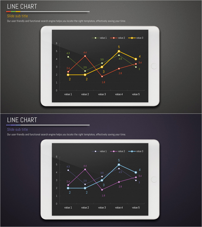
A multi-series line chart PowerPoint slide designed to visualize market trends and future outlook with clarity and precision. Three color-coded data series (yellow, red, blue) track five data points across time, making it easy to compare growth patterns and identify inflection points. Numerical values are displayed at each data point for accurate reference, ideal for executive presentations, quarterly reports, and strategic planning decks. The 2-slide set offers alternative color combinations to match your brand guidelines and presentation context.
Usage Points
-
Main Usage
Effectively communicate time-series data across multiple categories—such as sales trends, market performance, or competitive benchmarking. The multi-series format allows stakeholders to instantly compare growth trajectories and identify diverging patterns, making it ideal for data-driven decision-making in board meetings and investor presentations.
-
How to Use
Insert into the analysis or results section of your presentation to provide quantitative evidence. Simply replace the sample data and labels with your own figures; the chart structure remains fully editable. Choose between the two color variants to align with your corporate branding or presentation tone.
-
Recommended For
Executives, business analysts, marketing managers, financial professionals, and consultants presenting quarterly results, market analysis, financial performance, or forecasts. Perfect for investor relations, strategic planning sessions, client proposals, and competitive analysis presentations.
-
Slide Structure
Dark background with a coordinate grid (Y-axis 0–6, X-axis value 1–5) displaying three intersecting line series in distinct colors. Data point values are labeled directly on the chart, and a legend identifies each series for quick reference and comparison.
Related Products
-

Camera and Line Chart Comparison - Market Trends and Future Outlook
#Market and Competitor Analysis #Graph #Other
-

Brown Green Area Chart – Data Trend Analysis
#Market and Competitor Analysis #Graph #Other
-

Trend Color Wide Template Line Chart – Market Trend Analysis
#Market and Competitor Analysis #Graph #Future Outlook
-

Competitor Analysis Broken Line Graph – Visualizing Market Trends
#Market and Competitor Analysis #Graph #Other
