Tooth Sugar Increase Decrease Diagram – Profitability and Expected Effects
RJ0400034_9
- Last Update 05/26/2025
- File Size 2.6MB
- # of Slides 2
- File Format PPTX
- Slide Ratio 16:9
- Color
Keywords
- #Content-Based Slides
- #Design-Based Slides
- #Business Strategy
- #Diagram
- #Graph
- #Other
- #Financial Outlook & Expected Impact
- #Achievements
- #Flow
- #Multidirectional Flow
- #16:9
- #bidirectional arrow diagram PowerPoint
- #increase decrease comparison slide
- #contrast diagram PPT
- #profitability analysis presentation
- #performance metrics slide template
About the Product
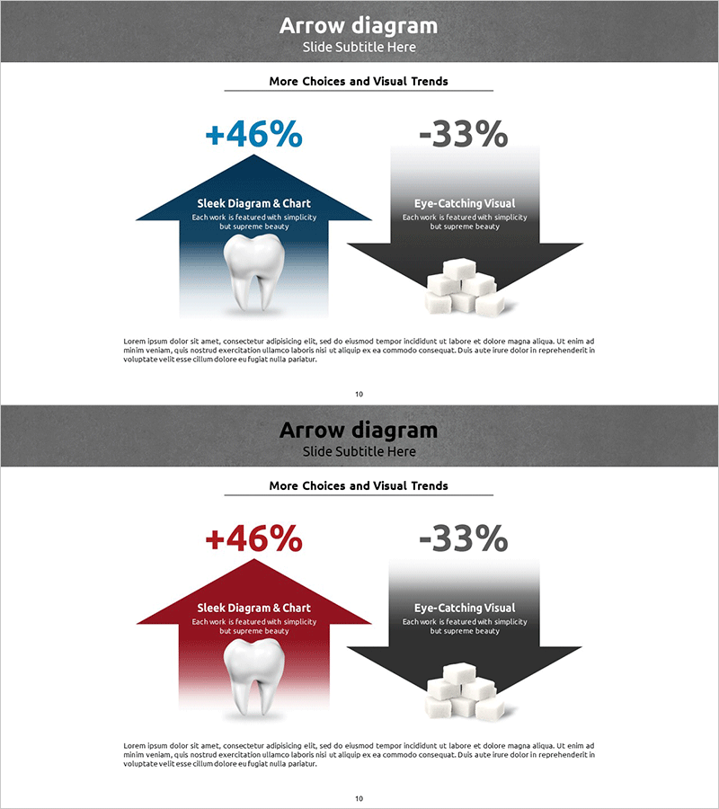
A bidirectional arrow diagram PowerPoint slide that simultaneously expresses upward and downward trends with contrasting visual impact. The upward arrow in navy blue and downward arrow in black create a clear comparison structure, ideal for presenting opposing metrics such as revenue growth versus risk reduction. Each arrow contains icons and text fields to display quantitative data (+46%, -33%) alongside qualitative descriptions. This 2-slide set offers color variations (navy and wine red) optimized for 16:9 widescreen format. Perfect for financial reports, performance analysis, marketing effectiveness measurement, and any presentation requiring side-by-side comparison of contrasting outcomes.
Usage Points
-
Main Usage
Designed to compare and emphasize two opposing metrics or outcomes simultaneously. Visually contrasts positive performance (growth rates, upward trends) with negative impacts (cost reduction, decline rates) to clarify decision-making rationale. Applicable to financial performance reporting, marketing effectiveness evaluation, risk management analysis, and business impact assessment where quantitative comparison is essential.
-
How to Use
Insert positive indicators (revenue increase, customer satisfaction rise, efficiency improvement) in the upward arrow and negative indicators (cost savings, risk reduction, churn decrease) in the downward arrow. Edit numerical values and descriptive text within each arrow to match your presentation context. Utilize color-variant slides to align with presentation theme or emphasize specific points.
-
Recommended For
Recommended for quarterly and annual financial reports by finance teams, campaign effectiveness analysis by marketing departments, executive strategy meetings, investor presentations, client proposals from consulting firms, and performance outcome presentations by educational institutions. Particularly effective in high-level decision-making settings where quantitative evidence and visual impact are equally critical.
-
Slide Structure
Comprises 2 slides with identical diagram structure but different color schemes (navy blue and wine red variations). Each slide features a title area at the top center, with a leftward upward arrow (blue tones) and rightward downward arrow (black/dark tones) in symmetric arrangement. Icon placeholders (tooth and sugar cube imagery), numerical text fields, and descriptive text input areas are positioned within each arrow, with additional explanation space at the bottom.
Related Products
-

Changes in the Region Graph – Business Strategy and Outcomes
#Business Strategy #Graph #Other
-

Spot Multidirectional Diagram – Visualizing Business Strategies
#Product/Service Introduction #Business Strategy #Diagram
-

Climbing Silhouette Bent Line Graph – Market Analysis and Performance
#Business Strategy #Market and Competitor Analysis #Graph
-

Auto Industry Roadmap – Visualizing Business Strategy
#Business Vision and Strategy #Business Strategy #Diagram
